There are two types of people in this world: those who know the Pantone color of the year and those who are wondering why they keep seeing the same colors everywhere. Now, you’re in the first group. Each year, Pantone selects a color for the year. It’s usually inspired by universal moods and aimed to challenge design norms.
2020 Pantone Color of the Year
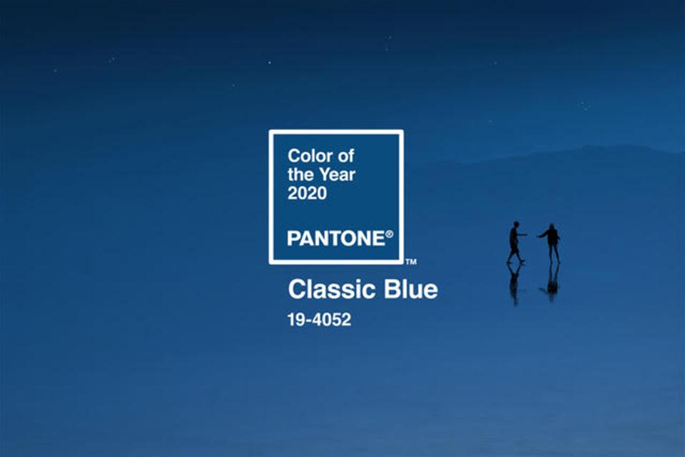
This year, the Pantone color of the year is PANTONE 19-4052 Classic Blue. For 2020, they chose this color as a “reflective” and “resilient” tone that brings a sense of peace, trust, and refuge.
Instilling calm, confidence, and connection, this enduring blue hue highlights our desire for a dependable and stable foundation on which to build as we cross the threshold into a new era.
PANTONE
Personally, I find it to be a very usable, if somewhat forgettable color. It’s a good blue but, won’t necessarily stick out in design over the next few months. I think the longer impact will be on color pairings as designers create palettes around this hue.
How the Pantone Color of the Year Impacts Design
The color of the year influences visual trends in the months following Pantone’s announcement. Aesthetic preferences are shaped by the tone in every area of design from products to media.
Designers Get Inspired
When Pantone makes their announcement, designers follow the story behind their selection. It then inspires them to incorporate the tone into their projects.
The Color Trends
As designers work the hue into their projects, in large and small doses, the color begins to trend. Color palettes shift to incorporate the new Pantone color of the year.
People Look for the Color
Finally, consumers start to look for the color both consciously and unconsciously. If they like the tone, their eyes will glide toward anything that makes use of the color.
Every Pantone Color of the Year Since 2007
Since 2007, Pantone has announced a Color of the Year — influencing the visual trends for several seasons. For this journey through the years, I researched each color, looking for ways that designers picked up the tone in the months following the color launch.

Pantone Color of the Year 2019: Living Coral 16-1546
By 2019, people outside of the design world have become aware of Pantone’s announcement. It trends on social media as professionals and enthusiasts take inspiration from the tone. Even though other brands, especially paint manufacturers, try to announce their own color of the year, Pantone’s choice is universal.
An animating and life-affirming coral hue with a golden undertone that energizes and enlivens with a softer edge.
Pantone
Last year, “Living Coral” invigorated design. It’s a happy color that combined well with both bright color combinations and moody designs. You often saw it as a pop of color instead of overtaking an entire design. Additionally, a lot of visual treatments took on warmer tones.

As a result, many designs in 2019 had an orange glow to them. The result was cheery and a bit nostalgic. See Living Coral 16-1546 Inspiration

Pantone Color of the Year 2018: Ultra Violet 18-3838
The response to “Ultra Violet” was overwhelmingly positive in 2018. It was sharply different than some of their previous choices — very modern and bold.
A dramatically provocative and thoughtful purple shade, PANTONE 18-3838 Ultra Violet communicates originality, ingenuity, and visionary thinking that points us towards the future.
Pantone
Many designers looked to the heavens, and science fiction, as they incorporated the color. Celestial patterns and complex lighting added a futuristic feel.

In general, the choice felt very trendy — making an interesting counterpoint to the soft millennial pink all over mainstream aesthetics. See Ultra Violet Inspiration
Pantone Color of the Year 2017: Greenery 15-0343
Personally, I hated “Greenery” in 2017 and agreed with everyone who compared it with Musinex branding. At first glance, it was just too bright.
A refreshing and revitalising shade, Greenery is symbolic of new beginnings.
Pantone
As people played with the asthetic, I started to like it in small doses. For example, a mimimalist, white design can benefit from an airy pop of green.

The lasting influence was a revival of clean, nature-inspired imagery. See Greenery Inspiration

Pantone Color of the Year 2016: Rose Quartz 13-1520 & Serenity 15-3919
Two colors of the year took everyone by surprise in 2016. The combination was quite welcome.
A softer take on color for 2016: For the first time, the blending of two shades – Serenity and Rose Quartz are chosen as the Pantone Color of the Year.
Pantone
For years, pastel had been passée — relegated to “old ladies” and shabby chic. These tones were soft without being washed away.

Designs that stayed away from watercolors, and instead contrasted the soft colors with hard materials elevated the concept. And now we can’t get way from that light pink. See Rose Quartz & Serenity Inspiration

Pantone Color of the Year 2015: Marsala 18-1438
Not that “Marsala” hit with a thud… but it definitely had a slow burn. You see this color more now than when Pantone first made the announcement. I remember thinking, “That color looks good on almost everybody.”
A naturally robust and earthy wine red, Marsala enriches our minds, bodies and souls. The impactful, full-bodied qualities of Marsala make for an elegant, grounded statement color when used on its own or as a strong accent to many other colors.
Pantone
Indeed, wine tones are still everywhere from cosmetics, to clothing to feature walls. It’s almost become a new neutral.

In designs, it’s influenced the tone by pushing warmer lighting options and less visually jarring color combinations. See Marsala Inspiration
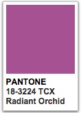
Pantone Color of the Year 2014: Radiant Orchid 18-3224
A color that seemed tailored for the wedding industry, “Radiant Orchid” brought bright color pops into a lot of designs. While you saw some monotone aesthetics, the color worked best when it was paired with a contrasting color.
Radiant Orchid blooms with confidence and magical warmth that intrigues the eye and sparks the imagination. It is an expressive, creative and embracing purple—one that draws you in with its beguiling charm. A captivating harmony of fuchsia, purple and pink undertones, Radiant Orchid emanates great joy, love and health.
Pantone
As a result, oranges and blues shifted warmer and bolder — created a new look for luxury.

The longterm impact? Designers thought about new ways to pair jewel tones with moody colors. See Radiant Orchid Inspiration

Pantone Color of the Year 2013: Emerald 17-5641
My favorite designs with Emerald paired it with that delightful “poppy” orange. When Pantone initially announced the color, it seemed like just another jewel tone.
Lively. Radiant. Lush… A colour of elegance and beauty that enhances our sense of well-being, balance and harmony. Most often associated with brilliant, precious gemstones, the perception of Emerald is sophisticated and luxurious.
Pantone
Instead of leaving it with purples and pinks, the best combinations added inspiration from nature like bright reds, oranges and even browns and natural greens.

Also, the complete mermaid vibe cannot be ignored. That whimsey is why you still see this tone crop up in playful concepts. See Emerald Inspiration

Pantone Color of the Year 2012: Tangerine Tango 17-1463
This color automatically reminded me of Jonathan Adler’s “Happy Chic” where he reccomends every room incorporate a pop of orange. 2012 was a hard year, still coming out of a recession and living in a tense global political environment. When Pantone announced “Tangerine Tango” it contrasted the way we were all feeling.
Reminiscent of the radiant shadings of a sunset, Tangerine Tango marries the vivaciousness and adrenaline rush of red with the friendliness and warmth of yellow, to form a high-visibility, magnetic hue that emanates heat and energy.
Pantone
That heat warmed up photography, adding a soft glow to many aesthetics. All things orange were paired together — bright and hopeful.

Now, orange is a serious mainstay in interior design — and we’ll never discount a orange-red lipstick again. See Tangerine Tango Inspiration

Pantone Color of the Year 2011: Honeysuckle 18-2120
When I was reviewing these colors, I thought, “Oh, that’s the one that everyone used on bridesmaid dresses.” Then, I realized that the comedy film, “Bridesmaids” was actually released that year with that tone on the movie’s promotional art. Now, whenever I think of Pantone’s “Honeysuckle” I see a million frosted cakes, gerbera daisy floral arrangements, and satin wedding gown sashes.
Courageous. Confident. Vital. A brave new colour, for a brave new world. Let the bold spirit of Honeysuckle infuse you, lift you and carry you through the year. It’s a colour for every day – with nothing “everyday” about it. A dynamic reddish pink, Honeysuckle is encouraging and uplifting.
Pantone
It was a very happy, wearable color that has still stuck around in clothing. Softer than a true red, the tone looks very confident.

And when Rhihanna dyed her long locks, the color was sealed as a forever pretty tone. See Honeysuckle Inspiration

Pantone Color of the Year 2010: Turquoise 15-5519
Although I love “Turquoise” I didn’t remember much hype around it in 2010. As I was looking back, I had a hard time finding it in designer’s lines. Whenever I did see it, it was used as a new nostalgic.
Combining the serene qualities of blue and the invigorating aspects of green, Turquoise inspires thoughts of soothing, tropical waters and a comforting escape from the everyday troubles of the world, while at the same time restoring our sense of well being.
Pantone
You could find it paired with mustard and coffee tones that reminded me of linotype art. Most notably, I saw that the “Alice in Wonderland” aesthetic revolved around softer versions of turquoise.

In later years, the tone has picked up — although a little lighter in most cases. See Turquoise Inspiration

Pantone Color of the Year 2009: Mimosa 14-0848
In 2009, “Mimosa” was a brilliant turn toward risky color-picking for Pantone. Yellow is always hard to work into designs. It can overwhelm an idea quickly. Mimosa balanced the idea of a bright hue with the reality of creating a color palette.
The colour yellow exemplifies the warmth and nurturing quality of the sun, properties we as humans are naturally drawn to for reassurance. Mimosa also speaks to enlightenment, as it is a hue that sparks imagination and innovation.
Pantone
Close to a digital gold tone, fits well with both pure white and shades of brown. Personally, I liked it as a way to “antique” an idea.

As a filter, Mimosa makes things look golden, historical, and rich. See Mimosa Inspiration

Pantone Color of the Year 2008: Blue Iris 18-3943
I wouldn’t be surprised if this color has a comeback in the next few years. It’s strong and feels smart. Blue is a popular color and Pantone’s “Blue Iris” is an interesting midway choice between a true, royal blue and a deep purple.
Blue Iris best represents colour direction in 2008 for fashion, cosmetics and home products. As a reflection of the times, Blue Iris brings together the dependable aspect of blue, underscored by a strong, soul-searching purple cast.
Pantone
As I was looking for examples of the color from 2009, I was reminded of the “Dark Knight” aesthetic. While Heath Ledger’s Joker does wear a purple suit, the blue and purple tones pervade the cinematography. The overall effect was dark, and a little bit whimsical.

Often, I found designs that used “Blue Iris” to contrast a deep red color. It’s a heavy look but, one that you could see coming around as a old-is-new look. See Blue Iris Inspiration

Pantone Color of the Year 2007: Chili Pepper 19-1557
As their first ever announcement, Pantone launched “Chili Pepper” as the color of the year. Looking back, it was a safe choice because it had staying power. That color works well with a lot of different color combinations. It’s practically an earth tone.
This engaging, resonant hue strikes a high note for fashion and personal expression as its boldness is appealingly eye-catching, sophisticated and enticing. In a time when personality is reflected in everything from a cell phone to a web page on a social networking site, Chili Pepper connotes an outgoing, confident, design-savvy attitude.
Pantone
With that announcement, Pantone separated those in-the-know from those out-of-the-loop. Although people knew about design, designers (in every arena) were just starting to get name recognition for their work. Everyone could put their portfolio on the internet, promote their ideas on social media and gain a following.

It’s cool to think that the whole process started with “seeing red.” When I found the cover art for Nora Jones’ “Not Too Late,” I thought, “That’s it. That’s the 2007 aesthetic.” It’s fun to see how far we’ve come. See Chili Pepper Inspiration
Looking back through the years, I was fascinated by the ways the tone infiltrated design each year. For brands that want to stay relevant, the color is an easy way to show an awareness of what is trending.
How to use the Pantone Color of the Year in Your Promotions
If you’d like to use this year’s color , there are several ways to work it into your promotions without losing the integrity of your brand.
1. Refresh Your Window Displays: In a retail space, window displays signal “what’s new” to passersby. If you want to draw people in from the street, try using the color in your window displays.
2. Use as a Complementary Color in your ads: Keep the main colors of your brand the focus in your advertising. But, if you need to add a pop of color, try adding in the tone.
3. Group by Color for Flatlays: If possible, search your store for items in the color. You may even consider ordering mainstay products in a short run of the hue. Put them on a white background (or a colorful background if that matches your aesthetic). Snap it and share it to trend alongside similar visual groupings.
4. Invest in a feature wall: If you can swing it, create a feature wall — for selfies– in your space. Use the color creatively within the bounds of your brand. Then, as you incentivize customers to take photos in front of it, people will see that your store fits with current aesthetics.
If your brand wants to appear relevant, incorporating the color of the year into your promotions signals an awareness of current aesthetics.
Stay Inspired
If you enjoyed this article, you’ll love my instagram feed. I’m always posting new promotional ideas and free graphics. Join the conversation by following me at verdera.me.