In our culture, color has meaning. That’s the science of color in branding.
Over the years, color theory (and color psychology) has had a huge influence on design. For branding colors visually signal aspects of the brand. The main debate around the science of color revolves around the source of this meaning. Some think our interpretation of color meanings comes from an innate (from a biological impulse) source. Others believe we learn it (from use in society). Choosing brand colors requires a little bit of science and a little bit of art.
The Science of Color Psychology
At this time, the evidence seems to point to both innate and learned factors. For example, some scientific studies have shown human behavior can be influenced by the use of warm (reds) or cool (blues) tones. On the other side, a vast cultural history gives meaning to colors. Regardless, every study and every anecdotal example has become part of the reinforcing loop of color associations.
According to a 1997 survey by Cooper Marketing Group, Oak Park, IL, power is represented by the color scarlet red for 25% of respondents, black for 17% and bright violet blue for 13%. More than 55% of those surveyed chose one of these three colors out of 100 colors. Fragility was most represented by pale pink (27%), white (9%), and pale lavender (9%).
KATHY LAMENCUSA, EMOTIONAL REACTIONS TO COLOR
As branding has matured, these meanings have become even stronger. When studies like the well-known Cooper Marketing Group show red, black, and blue as powerful tones, those tones experienced widespread adoption throughout corporate America.
Color Studies
In fact, individual colors have been specifically studied for their impact on human attraction.
Several years ago, Andrew Elliot, a professor at the University of Rochester, and his colleagues began by asking heterosexual male undergraduates to spend five seconds looking at the photo of a young female stranger, and to rate her attractiveness on a scale ranging from 1 (not at all attractive) to 9 (extremely attractive). All of the undergrads saw the same woman wearing the same clothes—but the experimenters randomly changed the color of the thick border that framed the photo, alternating among white, red, blue, and green.
Psychologists know some things about color: Blue is the most popular color in the world, black is associated with elegance, wealth, power, and strength, green soothes and calms, and red is the color of love and romance.Adam Alter, I See Red
But Elliot and his colleagues were trying to figure out whether color can actually change a person’s appeal. Across five experiments, the results were always the same. The male undergrads who rated the photo bordered in red, found the woman more attractive, were more interested in asking her on a date, and willing to spend more money during the date. The researchers were also careful to show that the effect was specifically tied to sexual interest. They showed, for example, that when heterosexual women rated the attractiveness of the same female stranger, they weren’t swayed by the border’s color. In addition, men didn’t believe the red-bordered woman was more likable, kind, or intelligent—only that she was more attractive and sexually appealing.
You can see why certain studies had an influence on how people pick a tone for their brand.
Common Color Associations
At this time, in American culture, colors are tied to very specific meanings. These are generally accepted by designers and taken into consideration when developing a brand.

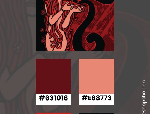
Red
Red alerts us to pay attention. It is sexy, provocative, dynamic, stimulating, and exciting.
Kathy Lamencusa, Emotional Reactions to Color
Red remains an eye-grabbing color. In the past, red was often added as a spot color in print. It stood out in black and white advertisements. You’ll often see red as the core color for a long-established brand.
People usually associate this color with:
- Lust
- Power
- Excitement
- Love
- Anger
Example Brands
- KFC
- Coca Cola
- Target
- Netflix
- Nestle
Red is typically seen as a color of attraction for several reasons. First, it’s been largely touted as a sexually appealing tone for women. Red lipstick and red dresses are lauded in women’s magazines as a way to catch a guy’s attention. Second, the restaurant industry has adopted the idea that red stimulates the appetite. While the color is used throughout many different types of brands, it’s very common for organizations that work with food.
Pink
Color historians, if there is such a thing, have pointed out that pink for girls became an accepted part of American culture in the 1930s and 1940s.
How to Know If a Pink Logo Is Right For Your Brand
People usually connect pink to femininity. A stroll past toy aisles shows how often toymakers use pink to target young girls. Consequently, it’s often seen as a youthful color, especially in brighter hues.
People usually associate this color with:
- Sophistication
- Sincerity
- Femininity
Example Brands
- Barbie
- Victoria’s Secret
- Baskin Robbins
- T Mobile
While there are outliers, like the Taco Bell logo, the color isn’t common for big brands. Niches for women use pink most often.
Orange
If we are to take the shades of orange, each one has a particular meaning. Peach color is excellent for communication, influences good manners and calms down. Golden orange represents vitality and self-control. Amber helps the confidence and self-esteem, but it can also give a degree of arrogance. Burnt orange is the color of aggression, pride, and tension. Dark orange the color of the advantage taker, making a selfish earn out of everything.
Dena Przybyla, Orange Color Psychology and Meaning
Safety signals often use the color orange. It stands out, much like red. You often spot it in utilitarian settings, like construction sites. Brands associated with rugged activities prefer orange.
People usually associate this color with:
- Boldness
- Safety
- Construction
- Utility
Example Brands
- Home Depot
- Popeyes
- Firefox
- Nickelodeon
For logos, it’s not a popular corporate color. It’s a complementary shade so, it wasn’t used as much during the early days of printing. Now, softer shades of orange are starting to pop up in design — from peach to gold.
Yellow
Certain shades of yellow, to some personality types, are associated with uncertainty and restlessness. Yellow cautions us to be careful.
Kathy Lamencusa, Emotional Reactions to Color
Tones of yellow are usually used to signal positive feelings. It’s a difficult tone to use because it doesn’t pop against white. Yellow must be layered on a darker color to really have a visual impact. Few big brands use it as their core color.
People usually associate this color with:
- Competence
- Happiness
Example Brands
- McDonald’s
- Best Buy
- Nikon
- Livestrong
You don’t see it as a core color because it can be hard to integrate into a design. When used correctly, it feels fresh and signals positive feelings.
Brown
The color brown is quietly confident and stabilizing. If your brand personality has a strong sense of duty and responsibility or is practical and down-to-earth, and your target audience values stability, quality, and wholesomeness, brown could be an optimal color choice.
LogoMaker
An earth tone, brown connects the mind with the natural world. You see it in brands that embrace the senses like food or handmade goods. Chocolate, leather, and coffee beans all evoke the tactile aspects of brown.
People usually associate this color with:
- Ruggedness
- Chocolate or rich foods
- Leather or handmade goods
Example Brands
- UPS
- M&Ms
- Hershey’s
- Cracker Barrel
- Louis Vuitton
Less intense than a straight black, using brown adds nuance to a design. It does not signal luxury as strongly.
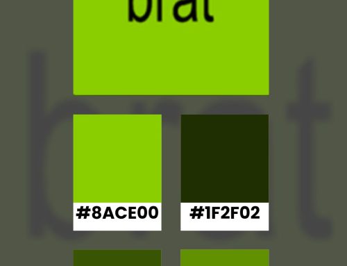
Green
Often associated with the environment, forest green has been used for designs related to causes supporting the earth and its ecosystem.
Canva
A life-affirming tone, people see green as a natural and sensuous color. Most people link it to friendliness, refreshment, and healing. Dark green colors telegraph wealth, fame, and power.
People usually associate this color with:
- Good Taste
- Envy
- Power
- Wealth
- Healing
Example Brands
- Whole Foods
- BP
- Spotify
- Starbucks
Whenever you see a brand using green, they usually picked the bright or dark end of the spectrum with intention.
Blue
If you review all 500 companies, as I did, you’ll find that Blue (37%) and Black (31%) dominate the core colors for logos.
Danielle Verderame
Light and bright blues are linked to drama and energy. Dark blues are corporate and institutional. Brands frequently use this color because it’s safe without being as harsh as black.
People usually associate this color with:
- Masculinity
- Stability
- High Quality
- Corporate culture
Example Brands
- General Electric
- Geico
- Dell
- HP
Most big brands use this color. So, it does signal a lot of stability. Companies that use blue visually align themselves with the values of well-known organizations.
Purple
Purple is the hardest color for the eye to discriminate.
Color Matters
Although most young people see purple as a happy color, people usually associate it with sophistication because of its rarity. It’s not easily found in nature and thus, was scarce in early design.
People usually associate this color with:
- Authority
- Sophistication
- Power
Example Brands
- Yahoo!
- FedEx
- Cadbury
Overall, it’s sensual and a little mysterious. You often see it in spiritual and majestic designs.
Black
While black is still associated with death and mourning, today, it is also associated with sophistication and strength.
Kathy Lamencusa, Emotional Reactions to Color
Strong, classic, and elegant describe our feelings about black. When used correctly, it aligns a brand with strong, established organizations.
People usually associate this color with:
- Grief
- Sophistication
- Expensive
- Fear
Example Brands
- Nordstrom
- Adidas
- Apple
In general, the color black blends in. If you use it in a logo, you have the freedom to add other colors into your designs around the simple logo (like Apple during the 00s iPod campaigns.)
Color Theory in Branding
As more designers have used color theory to shape brand decisions, the meanings behind the colors have become reinforced. You can see this when you look at the logos for top brands and how they’re used throughout each industry.
If you found this article interesting, please keep in touch by following me on Facebook or Instagram.
Pin & Share

Additional Reading
- Aesthetic preference to color combinations: preference, harmony, and similarity by Karen B. Schloss and Stephen E. Palmer
- Are You Selling the Right Colour? A Cross-cultural Review of Colour as a Marketing Cue by Mubeem M. Aslam
- Color Red: Implications for applied psychology and marketing research by Chris Piotrowski
- Color Psychology by AlterSpark
- Do You See What I See from Documentary Mania
- Emotional Reactions to Color by Kathy Lamencusa
- I See Red by Adam Alter
- Understanding Colour Psychology for Restaurants & Brands by Ashley Anastasia Howell