Avoid a straight-black background for your artistic website design by using these moody colors. They’re fresh — inspired by a deep and dark aesthetic. They remind me of dark art galleries, quirky coffee shops, and out-of-the-way bookstores.
Moody Colors for Artistic Website Designs
To create these color combinations, I collected colors that would instantly evoke thoughtfulness. Whether you’re working on a portfolio design or a text-heavy blog, these color combinations signal a slow burn.
Weight of the World Colors
This group brings alternating warm and cool shades of brown together.

Inspired by the murky textures of mud on pavement, the brown-black and light gray work together for backgrounds and text elements. The lightest beige offers a background option that coordinates with the gray and brown tones.
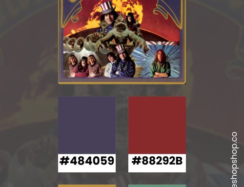
Not About Angels Colors
Starting with the deepest green as a background, this design drops blood-red into a swirl of classic tones.

Together, the rich colors remind me of a carefully curated collection of hardbacks. The deep colors offer a moody backdrop for the pop of gray text. Keep it simple by layering the darkest colors together for feature boxes and using the red sparingly.
Sticks and Stones Colors
Retro hues come together in this collegiate color palette. It reminds me of an old yearbook cover or a vintage student newspaper.

The deepest green tone offers hints of yellow that coordinate with the other tones. For text, the warm gray maintains readability without creating a cold contrast.
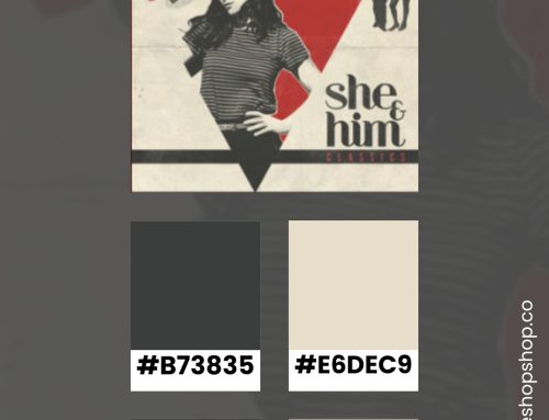
Heartbeat Bands Colors
Shades of greige work together in this soft color combination.

They remind me of yellowed paperback pages that smell of a musty bookstore. If you choose the lightest gray as your background, the other tones work well for feature boxes. The darkest brown creates readable text while maintaining a soft allure.
Stay Inspired
If you liked these colors, you’ll love my Color Inspiration Pinterest board. I often pin color palettes with hex codes.


