If I had created a tone named “chili pepper”, I probably would have chosen a dark orange. This would be less accurate — simply because my mind brings up images of orange-red peppers from my childhood supermarket. They were probably imported, picked early and shipped, which would have affected their tone in comparison to something straight off the plant.
The 2007 color of the year for Pantone, known as Chili Pepper definitely has purple undertones.
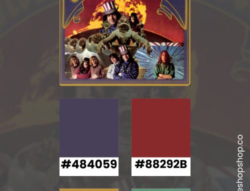
Pantone Color of the Year 2007: Chili Pepper 19-1557
As their first ever annual announcement , Pantone launched “Chili Pepper” as the color of the year. Looking back, it was a safe choice because it had staying power. That color works well with a lot of different color combinations. It’s practically an earth tone.
This engaging, resonant hue strikes a high note for fashion and personal expression as its boldness is appealingly eye-catching, sophisticated and enticing. In a time when personality is reflected in everything from a cell phone to a web page on a social networking site, Chili Pepper connotes an outgoing, confident, design-savvy attitude.
Pantone
With that announcement, Pantone separated those in-the-know from those out-of-the-loop. Although the general public knew about design, designers (in every arena) were just starting to get name recognition for their work. Everyone could put their portfolio on the internet, promote their ideas on social media and gain a following.
It’s cool to think that the whole process started with “seeing red.” When I found the cover art for Nora Jones’ “Not Too Late,” I thought, “That’s it. That’s the 2007 aesthetic.” It’s fun to see how far we’ve come.
Looking back through the years, I was fascinated by the ways the tone infiltrated design each year. For brands that want to stay relevant, the color is an easy way to show an awareness of what is trending.

Chili Pepper Today
This isn’t a color I use often — as I gravitate toward calmer tones and minimalist designs. But, if you’re looking for a true red, this is the one. Chili Pepper brings out the rich and sexy undercurrent of red lipstick, brilliant accent walls, and smart, layered designs.
Personally, I love it for maximalist concepts, like you see in the magazine covers above. Place it next to equally strong hues for a full Wes Anderson aesthetic.