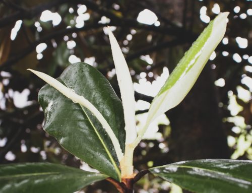
Soft shades of green often fill my camera roll. I’m not the only one who has been leaning into these herbal tones — with sage green becoming a huge color trend in 2020.
Layered with meaning, sage evokes two mental images — the fresh, fuzzy plant and the dried bundles associated with cleansing spaces. The leaves are aromatic and well-known for cooking, teas, essential oils, and body products. It’s the quintessential herb of health (the Latin root roughly means “healthy”).
Ancient Egyptians used the herb to boost fertility in women. Then, Romans adopted the plant as part of their spiritual and medicinal practices. The Chinese also used it for medicine in their teas. Later, the French adopted it for tea — with the spread continuing.
While its meaning varied, the plant has become associated with spiritual and physical health — a sort of body and soul balance. Visually, the soft green tone evokes a sense of peace and wellness.
Poised pleasantly amidst 2020’s uncertainty and stress, Sage pervaded feeds for fashion, interiors, and graphic design.
For Home
With extra indoor time, people started bringing fresh greens into their living spaces.
The gray-green hue is loved for its connection to the earth, and creating a sense of calm for all in its presence. – Better Homes and Gardens
Airplants hanging in light-filled windows dominated feeds. Often, the look accompanied beige walls and warm wood — making it an achievable aesthetic for the everyday person.
Soon, paint companies picked up on the trend with most of the 2022 paint palettes leaning toward green.
Paint manufacturers analyze many aspects of society, including global influences, fashion trends, and real-time paint color sales data as they form their yearly color forecasts. Color experts advise that global events such as the pandemic can play a significant role in the shades we gravitate towards when selecting colors for our home.
The paint companies unanimously noted in their 2022 forecasts that restorative colors, especially diffused shades of green, are gaining popularity with consumers. Reminiscent of nature, green hues, like the dusty shade featured in this office by Alair Homes, bring tranquility to our environments and help usher the outdoors inside. Look to shades of greens like olive, moss, and viridian (a dreamy blue-green hue) for a calming connection with nature. – Better Homes and Gardens
Alongside these greens, earth-inspired tones also began to trend. Back-to-nature buzzwords like forest-bathing (shinrin-yoku) solidified this urge to organic calm. Who didn’t want a home that made them feel well?
For Fashion
The sage trend came to fashion from a different route altogether. A pervasive desire for calm and a nostalgia for better times, sent us flipping through old looks — often bringing back 90s styles without much of a twist.
While old-school minimalists might stick to a palette of white, black, grey and maybe navy and beige, the new trend is all about soft colours. However, the one hue these two separate trends have in common is green—albeit vastly different versions. In the bold corner, it’s a forest green, and in the pared-back corner, it’s sage. Although I’m onboard with both versions of green, I’ve got to be honest, I think sage green is going to be the surprise chicest colour of the year. – ELINOR BLOCK, Who What Wear
Across the fashion universe, this ground-up green trend dominated fashion in all its forms. The runways jumped on the tones as a nod toward their 90s lines (think the days of true supermodels). Simultaneously, influencers went wild for pretty pastels — with sage green as the star. The saturation spread quickly — without much push from the algorithm. The monoculture may be dead but, the shared experience of the pandemic put us all in a sanity-seeking position.
Sage green was waiting for us — pretty and pleasant.
For Graphic Design + Content
Matcha-infused everything, silky leaves, and throwback, twee touches played a role in sage green’s return. If you didn’t use shades of green in your graphics — you just weren’t keeping up. Adobe actually release a sage green color guide saying, “The association of sage with the herb and its woody green parent can’t help but evoke feelings of the natural world, which in turn is associated with peace and harmony.” They recommended the hex #BCB88A for their preferred color of sage.
From a content perspective, pastel tones kept their grip. Filters became warmer. Blurs and grains snuck into edits. Everything was covered in a pretty, earthy haze.
https://www.instagram.com/p/CkyWFXLDDdO/
If you liked this…
Green isn’t going anywhere. The shade may shift from season to season (There’s already a lean toward Chartruse and Framboise) but, leafy hues will always influence color palettes. We’re too invested in the warm, natural vibe.
If you enjoyed this, check out my other articles about color theory and trends. I regularly write about color and design inspiration on all my accounts. Follow me on Instagram or Facebook to stay inspired.