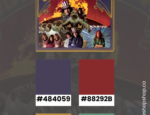
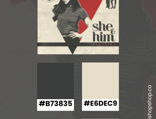
As Canva has become a popular, easy-to-use tool, its selection of available fonts has grown. In fact, if you have a subscription, there are few popular fonts you won’t be able to access within the tool. Below are some of my favorite Canva font combinations.
25 Canva Font Combinations
I challenge myself to create new font pairings from time to time. Sometimes, I simply jot them down in my notebook during a project. In this case, I wanted a visual record of the headline, subhead, and body copy fonts together — so I could easily grab them for client projects.
Nove Display with Gilam Bold and Antic Font

Nove Display is a quirky yet, elegant option for a headline. It has a Mediterranean feel without being too on-the-nose. Gilam is bold enough to stand alongside it without creating too much visual tension. Finally, I added antic font as a solid, readable sans-serif for the body copy.
Kingred Modern with Alata and Caldea

With the trend toward minimalism over the past few years, I can appreciate a heading font that’s a little bit extra. Kingred Modern’s distracting touches pair nicely with the balanced Alata font. To make the combination elegant, I chose the pretty, serif font — Caldea.
Fite Display with Overpass and Singel

Whenever I see an unusual retro-inspired font, I have to find a way to use it. This boxy display font pairs well with Overpass in all caps. Using a serif font like Singel creates an unexpected visual tension that makes your eyes linger.
Kelin Eator with Scandilover Script and Ovo Font

I love using a script for a subhead (or an H2 in web designs). It brings an unexpected disruption to the typography’s hierarchy. In this case, Scandilover script creates a pretty counterpoint to the elegant Kelin Eator font. For the body copy, a chose Ovo font — which is quickly becoming one of my serif go-tos.
Binggo Wood with Hero and Radley

Something about Binggo Wood Font reminds me of 70s fantasy book covers. It has that medieval block feel without the excess styling. To balance that illusion, I paired it with the minimalist Hero font for a subhead. Combined with the serif Radley font, this trio has personality without distracting from the message.
Barbra Display with Lexend Deca and Solway Font

I really dig the anti-design, non-aesthetic, Tumblr-ize trend that’s influencing design right now. However, it can be hard to pull off for some brands. This combination tries to marry the quirk of anti-design with something more classic.
Zico Display Black with Gabriel Sanz Bold and Monterchi Font

Often, when you research masculine design ideas, they’re so genderized that they look camp. I created this combination to balance out some of the feminine typography in my collection. Zico is bold without being a block or stencil text. Similarly, the clean lines of Gabriel Sans Bold as a subhead echo a masculine design treatment.
Stadio Now Display with Calps Font and Bree Serif

Stadio Now Display’s retro-leaning style begs for a balance between quirky and bold. I selected Calps font as a subhead because it also has an unusual balance to the letters. Then, I added Bree Serif as a classic serif to give the illusion of an old advertisement. Together, they signal that radio-age, vintage aesthetic.
Black Gold Display with Balgin Condensed Font and Inria Serif Font

Together, these fonts are begging for a high-end brand to scoop them up. Black Gold’s elegant lines and detailed angles look rich — especially in high-contrast designs. Balgin and Inria, by contrast, have a youthful feel — while being easy on the eyes.
Sugo Display with Open Sauce Light and Varela Round

Whenever I find a strange, yet fun display font, I default to a clean sans serif for the subhead. In this case. Open Sauce Light provided the perfect, highly readable solution. To keep it feeling fresh, I tried the Varela round font for the body copy.
Sebian Display with Livvic Bold and Lancelot Font

The risky choice of Sebian Display requires conventional supporting fonts to keep the look elevated. Livvic Bold as a subhead and Lancelot font for the body copy adds a serious, clean-lined element to this unusual display font.
Tan Headline with Radnika Next and Gordita Font

This combination started with the fact that I hate the name of Gordita font but, love its readability. I wanted to create something with it that had a bit of class — despite its silly name. I chose TAN Headline font, which has some unusual lines, and paired it with Radnika Next in all caps. Together, these 3 fonts actually look pretty.
South Korea Script with Luciole Font and PT Sans

Like many designers, I’m always on the hunt for good handwriting fonts. Although it’s not my typical style, I enjoy South Korea Script. It’s playful while still being pretty. Also, it’s readable — something that can be difficult to find in scripts. I decided to pair it with Luciole font and PT sans for a fun, modern look. The weights are similar without being the same.
Kompot Display with Rosario Font and Gilam Font

Together, these three fonts whisper high-end. Gilam font is one of my new favorite body fonts when I’m not sure if I want serif or sans serif. It’s somewhere in the middle and some letters have the elegance of italics. Alongside this body copy, Rosario Font and Kompot Display look serious and classy.
Kitsch Display with Amsterdam Four and Alata Font

Once again, I pulled fonts that verge on the anti-design trend. I couldn’t help myself when I found the Kitsch Display font. It’s a little of bit beer fest with a little bit of grandma’s kitchen. I imagine it doing well on something eye-catching like a poster. So, I chose Alata as the body copy font for its boxiness. Then, I added Amsterdam Four font as a playful, accent. It’s a little 1940s overall.
Gilda Display with BD Script Font and Telegraph Font

As a writer, I love body copy fonts that draw you into the words. Telegraph Font is readable and a little unexpected. Paired with Gilda Display and BD Script font, you can imagine this in anything from a magazine spread to a designer’s portfolio website.
Foday Display Font with Alatsi Gont and Hero Font

Sometimes, I find a secondary font first — like Alatsi Font. I knew it would make a great subhead for an unusual display font like Foday. After I put these together, I opted for a fresh, modern body copy with Hero Font. Altogether, they are classy without being staid.
Noto Serif Display ExtraC with Nourd Font and Barlow Semi Condensed

I keep combinations like this in my back pocket for a certain type of client. They want something safe but, don’t want to see the same, boring fonts. This trio of fonts works together to create some visual tension — while still feeling timeless.
Red Hat Display with Be Vietname Font and Telegraf Medium

I don’t often pair three sans-serif fonts together. But, some situations call for this ultra-modern, almost-minimal look. They all have a similar weight without using the same font at 3 sizes. It’s a safe choice but, one that would appeal to a SAAS client.
DM Serif Display with Gordita Font and Agrandir Narrow

I have a client that uses one of the Agrandir font weights as part of their brand and I love it as a quirky sans serif. For this combination, I wanted to see if I could balance the unusual Agrandir lines with something more serious. DM Serif Display is timeless while Gordita is somewhere between quirky and classic.
Big Shoulders Display with Neue Machina and Rosario

I fall into the habit of making all caps headlines. It’s an easy way to ensure a straight visual line as the main focus. But, some situations warrant a more interesting visual structure. For this combination, I wanted to make a the subhead really boxy and use an unexpected body copy font. Together, Neue Machina and Rosario are just as unexpected as the headline itself.
Playfair Display with Antic Font and Public Sans

Another favorite of mine, Playfair Display is pretty without being too feminine. Whenever a client says they wants something elegant or expensive, I try to use similar fonts to Playfair. In this combination, I decided to keep it young with two sans serif fonts. They’re not too precious, to keep with the design neutral and classic.
Klemer Display with Abeezee font and Brendon Font

Sometimes clients say “Vintage” but, they’re tired of seeing the same old thing. Klemer is a font I keep on hand to inspire retro designs. However, I prefer to pair it with modern options like Brendon Font and Abeezee font.
Gulfs Display with Garet Font and Canva Sans

I work with a lot of retail clients, which means I sometimes need masculine or funky options. I love the modern surfer vibe from this one. It’s a little bit retro with Gulfs Display — with two clean sans serif fonts in Garet and Canva Sans.
Armies Display with Lazord Sans Serif and Garet Font

Canva font combination 01
Armies Display font falls in line with this year’s heading trends. It’s detailed, elegant, and a little bit unexpected. Although the readability isn’t great for certain applications, it does well in high-contrast settings. Paired with Garent font for the body copy and Lazord Sans Serif as a subhead, this combination could be used for any pretty yet, playful design.
Did you like this post?
Find more design inspiration by clicking through to my blog archive. I regularly post about trending colors, font combinations, photography tips, and design ideas.
About Danielle Verderame
I am a writer first. I specialize in content-heavy websites, bringing together my 15 years of professional communication experience with my imaginative aesthetic. Most of the time, I optimize small business websites for search and social media to generate more traffic — and more sales.
As inspiration strikes, I generate lifestyle or educational content for publications. Most of it focuses on small businesses, supporting local initiatives, creative inspiration, and communication or marketing theory.
On my profiles, you’ll find creative inspiration for your small business. Whether you work a side hustle or run a full-time LLC, your online presence will benefit from my experience. My articles highlight advice and ideas to attract your niche audience.
Through Verderame, LLC. I offer my services to small businesses who need assistance with their websites, content, and search engine optimization. In 2023, I launched The Shop Shop — a Lynchburg marketing agency focused on everything retail.
We’ll make sure your products are online and ready to sell. And you can get back to the parts of your business that you love.
We’re ready to maintain, manage, and promote your store on any platform including WordPress, Squarespace, Shopify, Square Online (Weebly), Comment Sold, Pinterest Shops, and Meta (Facebook/Instagram) Shops.
Working with us is simple. I am the main point of contact on all my accounts. I visit in person or schedule phone calls to discuss your projects. My team members are all located in Central VA and we work together closely. Feel free to send me a message if you want to work together.