Music album cover art is a treasure trove of color inspiration, offering a unique blend of visual and emotional cues. By exploring the rich tapestry of album artwork across genres and eras, designers can unlock new and exciting color schemes that elevate their work. So next time you’re in search of color inspiration, consider the albums that move you musically and visually. You may just find the perfect palette hidden in plain sight, waiting to be discovered and transformed into something uniquely yours.
I regularly listen through artist’s discography in order. Then, I turn their album art into color palettes. As another band where I know about 5 songs from one of their albums, I decided to listen through Maroon5’s discography in order. With a quick search, I learned that they were originally Kara’s flowers, formed in high school. In general, I recognized Songs About Jane and a few hit singles from the 2010s.
Finding Color Inspiration in Music Album Cover Art
In the realm of design, color is a powerful tool that evokes emotions, sets moods, and brings concepts to life. While designers often look to nature, fashion, and interior design for color inspiration, an unexpected and vibrant source remains somewhat untapped: music album cover art. Album covers, with their eclectic and imaginative designs, are a goldmine for color inspiration, blending visual art with the auditory experience in a way that can captivate and inspire.
Music album covers have long been a canvas for artists and designers to experiment with bold colors, intriguing compositions, and thematic elements that complement the music within. From the psychedelic hues of the 60s to the minimalist palettes of modern indie albums, cover art provides a visual representation of the music’s essence. For designers seeking fresh and harmonious color schemes, analyzing these covers can offer unique insights. By dissecting the colors used in iconic or personally resonant album covers, one can uncover combinations that are emotionally compelling, culturally relevant, or simply aesthetically pleasing.
To leverage album cover art for color inspiration, start by selecting a range of covers that resonate with you, regardless of genre. Pay attention to the emotions and memories they evoke. What colors dominate? How do they interact? Use color-picking tools to extract exact shades and create palettes. Experiment with applying these palettes in your projects, whether it’s branding, web design, or personal art. Remember, the goal is not to replicate but to translate the mood and feel of the music into your design work. By doing so, you bridge the gap between auditory and visual experiences, crafting designs that resonate on a deeper level.
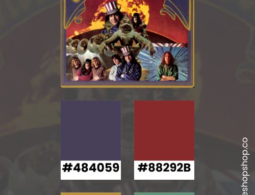
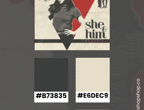
I made color palettes from all of Maroon5’s Album Covers
While I recognized the cover art for Songs About Jane, I was unfamiliar with all their other album art. I was surprised at how colorful the designs were. Even in the photo-heavy designs, they used coordinating pops of color to set the mood.


List of Maroon5 Albums
- We Like Digging? as Kara’s Flowers
- The Fourth World as Kara’s Flowers
- Songs About Jane
- It Won’t Be Soon Before Long
- Hands All Over
- Overexposed
- V
- Red Pill Blues
- Jordi
- The B-Side Collection
- Singles
- Call and Response: The Remix Album
Stay Inspired
If you enjoyed this color inspiration, visit my Pinterest profile. I regularly pin color combinations with hex codes.