That viral video about Stevie Nicks going to see Twilight in theatres and using the inspiration from that experience to develop a new album reminded me of her prolific songwriting career. As I listened through her solo discography, I enjoyed the thematic, otherworldly consistency of her music and aesthetic. The white witch left her mark on music with her ethereal voice and enthralling stage presence. So, I’ve put together color combinations inspired by Stevie Nicks’ album cover art.


As Stevie Nicks
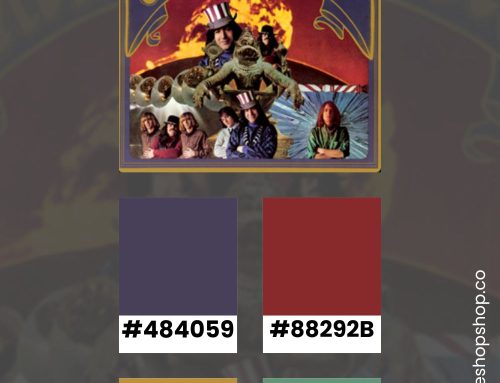
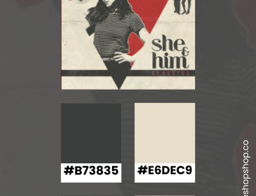
Although Fleetwood Mac has some amazing cover art, I stuck to Stevie Nicks’ solo albums for this roundup. The 1960s was a transformative decade marked by its distinctive cultural movements, including the rise of the hippie subculture and a fascination with the mystical and the esoteric. Stevie Nicks’ album cover art is an excellent visual reference for this style of design. You might notice that these aesthetics have resurfaced, offering a rich tapestry of inspiration for modern designers. Whether you’re aiming for a nostalgic nod to the past or a fresh take on these iconic styles, here’s how to infuse your designs with the spirit of the 1960s hippie and witchy aesthetics.
Bella Donna

The Wild Heart

Rock a Little

The Other Side of the Mirror

Street Angel

Trouble in Shangri-La

In Your Dreams

How to Embrace Stevie Nick’s Witchy Style in your Designs
If you want to emulate her vibe in a graphic design project, try these touchpoints.
Color Palette and Patterns
To capture the essence of the 1960s hippie aesthetic, start with a vibrant and eclectic color palette. Think bold, saturated hues such as sunflower yellow, electric blue, psychedelic purple, and lush green. These colors should evoke a sense of freedom, joy, and rebellion against the drab norms of the time. Incorporate patterns like paisleys, florals, and tie-dye, which were quintessential to the era. For a witchy twist, lean towards deeper, more mysterious shades like midnight blue, forest green, and rich burgundy. Patterns can be more intricate, including elements like celestial motifs, pentagrams, and alchemical symbols, adding a touch of the mystical to your designs.
Textures and Materials
Textures play a crucial role in bringing the 1960s hippie and witchy aesthetics to life. For backgrounds, opt for natural and organic materials such as wood, rattan, and canvas. Incorporate macramé shapes, a popular craft of the time. Layering different fabrics like patchwork quilts, crochet throws, and sheepskin rugs can add depth and warmth. For a witchy vibe, consider incorporating heavier, more opulent materials. Velvet, leather, and dark wood can create a luxurious and slightly eerie atmosphere. Add in elements like wrought iron candle holders, crystal balls, and antique mirrors to enhance the sense of enchantment and mystery. Using these as shapes and layers echos the photos from the album covers.
Elements and Accents
If you’re looking to branch out into different vibes, think about adding a plethora of plants to create a connection with nature. Vintage posters of music festivals offer layout ideas and graphic elements. To bring in more of Stevie’s vibe, reference tarot cards, spell books, Hanging tapestries, astrological designs, moon phase charts, and gothic mysticism. Lighting is key if you’re selecting photos. Opt for warm, dim lighting using fairy lights, lanterns, and lots of candles to create a magical ambiance.
By thoughtfully combining these elements, you can design projects that not only pay homage to free-spirited and mystical vibes but also feels fresh and relevant today. Whether you’re channeling the carefree energy of the hippie movement or the enigmatic allure of the witchy aesthetic, the key is to keep it original and a little rough.
Stay Inspired
If you enjoyed this color inspiration, visit my Pinterest profile. I regularly pin color combinations with hex codes.