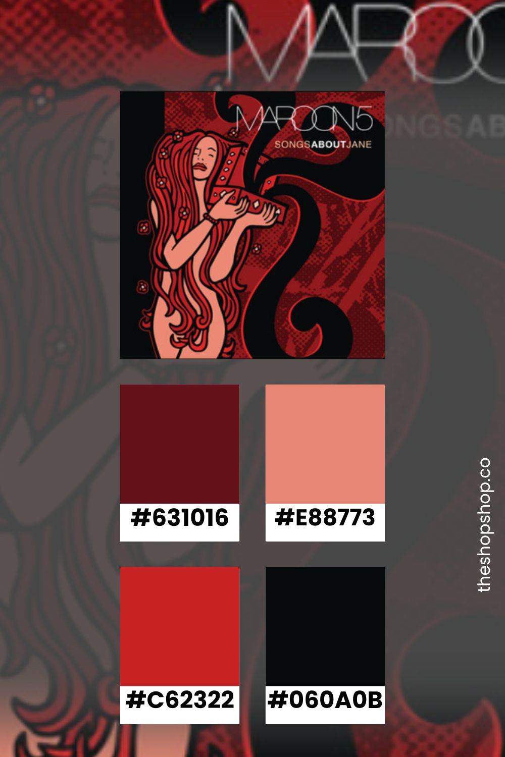
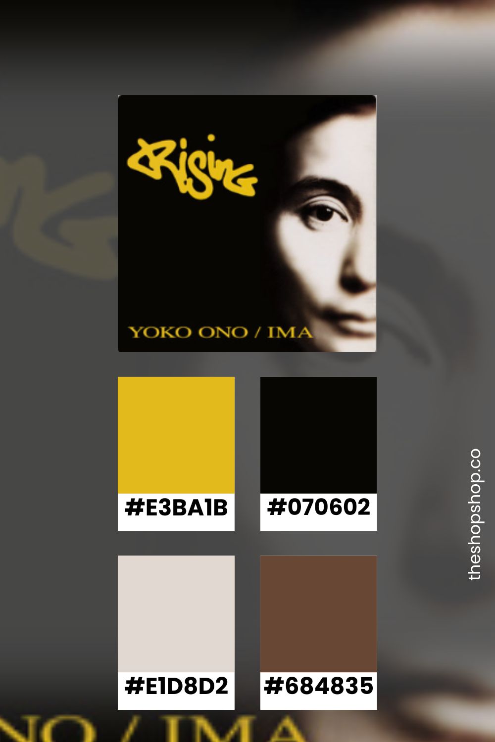
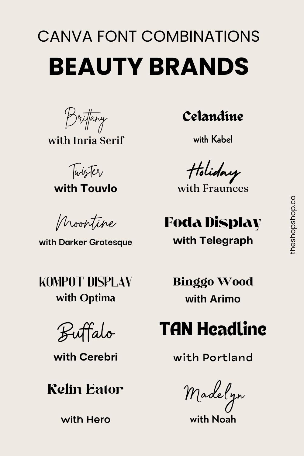
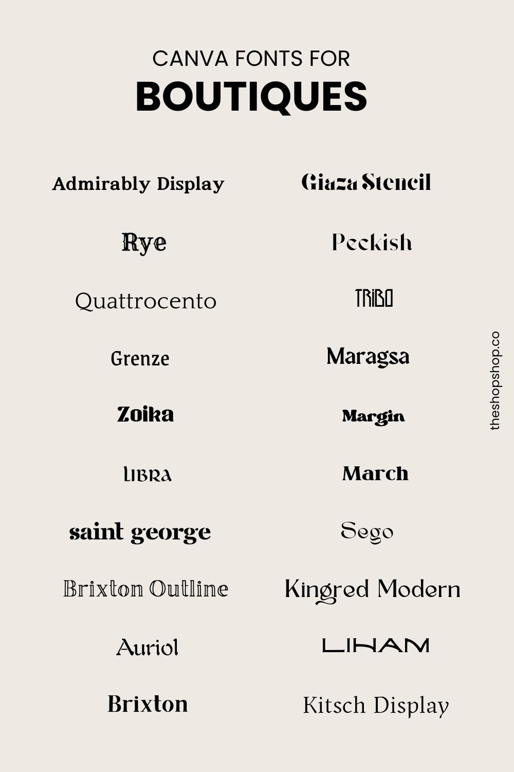
Open Hours: M-F, 8am – 3pm

Graphic & Print Design

I listened to Beyoncé’s discography and pulled colors from her album covers

Next on my list, I listened to Beyoncé's discography and pulled color inspo from her album covers. Interestingly, all the covers with Destiny's Child bore a visual similarity — simple monochromatic backgrounds and coordinated outfits. By contrast, Beyoncé's solo albums illustrate the creative journey of the music within. So, the colors vary greatly for each album. Overall, earth tones — like khaki and tan — are the most consistent elements. I listened to Beyoncé's discography With Destiny's Child Destiny's Child (1998) Killing Time Illusion Sail On The Writing's on the Wall (1999) Confessions Say My Name Survivor (2001) Happy Face [...]

By |2024-02-27T15:20:06-05:00February 27, 2024|Graphic & Print Design|

I listened to Jewel’s Discography and Created Color Palettes from her Album Covers

The first three albums were what I expected from Jewel. I knew many of the songs and the sound of the unfamiliar tunes didn't surprise me. By contrast, the title and cover art for 0304 surprised me. It was very 2000s pop in style and content — with song titles like Run 2 U, 2 Find U, and 2 Become 1. With Goodbye Alice in Wonderland, her songs returned to her folk and country roots. I listened to Jewel's Discography in Order These are the songs I added to my playlist. Pieces of You Who Will Save Your Soul I'm [...]

By |2024-02-16T11:29:01-05:00February 16, 2024|Graphic & Print Design|

Groundbreaking Floral-Inspired Color Palettes for Spring

Miranda Priestly may not approve but, spring florals often inspire color palettes. From bright tulips to soft, pastel buds, the blooms ground unexpected tones in earthy browns and mossy greens. Floral-Inspired Color Ideas Take a trip through any nursery or greenhouse and you'll quickly find colors that can bring your spring designs back to life. Designers often overlook classic blue colors for spring — as shades of pink catch the eye. These pansies provide a lovely mix of deep blue and purple tones. I'm always looking for lovely neutral tones — which spring buds and branches are quick to provide. [...]

By |2024-02-15T14:08:06-05:00February 15, 2024|Graphic & Print Design|

Cool Industrial Colors

Sweaters with sundresses, bulbs peaking through snowbanks, and the sun shining through bare branches herald early spring. It's a time when the eyes search for anything to break up the gloom and gray. Early spring holidays range from gleeful to garish. And patina has its moment. Cool, Industrial Colors Lately, I've been noticing cool, industrial colors as the bare landscapes draw the eye to the bones of winter. Rust pops and patina beckons. Below are a few color combinations I created to embrace this chilly, yet hopeful, time of year. If you liked this post Follow my Color [...]

By |2024-02-15T08:33:52-05:00February 15, 2024|Graphic & Print Design|

Plenty of Colors in the Sea: Living Coral Pantone Color of the Year 2019

Several years ago, my mom asked me what she should use as a second accent color in her living room. She had already painted the walls a bold blue so, I suggested coral. You can see why that color combination feels fresh. It's inspired by nature — and totally tropical. Living Coral Pantone Color of the Year 2019 When Pantone named their color of the year for 2019, designers were intrigued by the tropic-inspired tone. In reaction to the onslaught of digital technology and social media increasingly embedding into daily life, we are seeking authentic and immersive experiences that enable [...]

By |2024-03-28T14:48:21-04:00February 13, 2024|Graphic & Print Design|

I Listened to Taylor Swift’s Discography and Created Color Palettes from her Album Covers

Previously, I posted about how Taylor Swift's re-release of "Red" rekindled the discussion about unapologetic femininity. That controversy around her re-recording of masters and the conversation about being allowed to love her work, made me listen to her entire discography in order of release. I was aware of her work and her profile only as someone who pays attention to trends and media, not as a fan. Now, I'm revisiting all of her albums to pull color palettes based on her cover art. Taylor Swift These playful, tropical colors are perfectly 2000s. Fearless and Fearless Taylor's Version The sepia treatment [...]

By |2024-02-06T13:49:15-05:00February 6, 2024|Graphic & Print Design, Lifestyle & Aesthetic|

The Blues Have It: Summer Color Ideas for Graphic Designers

A quick roundup of paint company's colors for 2024 reveals a trend toward blue. It's not surprising in a year that is forecasted to be economically turbulent. Blue is a safe bet as one of the most popular colors for most people. Scroll through the colors below and find more inspiration in the color palettes I created to inspire graphic designers. Minwax: Bay Blue Source: https://www.minwax.com/en/wood-stain-color-guide/color-of-the-year/2024-coty This relaxing mix of blue and green expands our connection to water and wellness, moving beyond the growth-focused greens of recent years for a wholly immersive color experience. It invites you to interpret design [...]

By |2024-01-31T10:01:36-05:00January 31, 2024|Graphic & Print Design|

Summer Color Combinations for Graphic Design Projects

We're expecting a Barbie whiplash this summer — as the pendulum swings away from dopamine-inducing neons to subtler warm-weather tones. Don't be shocked to find other playful colors like canary yellow and mossy green to jump ahead of the pervasive pink. Take a look through these new 2024 summer tones to inspire your graphic design projects. Who What Wear Predicts Icy Blush "...I think it's safe to say that 2024 marks the decline of the hot-pink Barbie aesthetic that was so in demand last year. Instead, the pink we'll all reach for is a shade we're calling icy blush." - [...]

By |2024-01-31T09:10:59-05:00January 31, 2024|Graphic & Print Design|

Everything’s Coming Up Rose Quartz: Pantone’s Color of the Year 2016

Pink is a polarizing color. Aligned with feminity and unapologetic girliness, the tone saturated social media (and most of the design world) throughout the 2010s. Then, it was declared basic and a little bit toxic — along with girl-bossing and performative friend-squadding. Since the not-quite-bubblegum, not-quite-salmon shade was officially coined as such in Véronique Hyland’s 2016 essay, it’s gone from the hue you rosé-d all day with (while passing rosy-hued ads and debating which peachy-pink velvet sofa would best complement the neon sign you’d hang above it) to a basic—ahem, cheugy—shade everyone’s all too quick to declare passé. (Indeed, one of the [...]

By |2024-01-21T11:40:02-05:00January 21, 2024|Graphic & Print Design|

Tangerine Tango Pantone Color of the Year 2012

I remember 2008 fondly — when I rented my first apartment, solo. I had no money, and dove right into meshing curbside drag-aways with yard sale treasures and family hand-me downs. I splashed paint on anything that would hold it (as we did in the earliest days of Pinterest) and improperly prepared every surface. But, I had a good time and flexed my design eye in the way that you only can when you're single, living alone and binging (read: pirating) design TV shows on a brick of a laptop. As I picked, stripped, and reimagined, I found myself grabbing [...]

By |2024-01-20T11:02:34-05:00January 20, 2024|Graphic & Print Design|
Go to Top