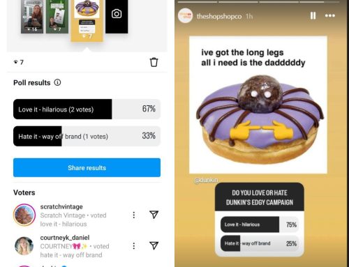
Product photos from my client with The Shop Shop
If the love you felt for your eStore has faded, you can bring back that old romance with some creative projects. Instead of rebuilding your entire website, you can refresh the style of your site (often without changing the site theme).
Rework Your Homepage
Sometimes, clients tell me they hate their eStore theme. Once we talk through the specifics, they actually just dislike the homepage. The other pages (like their Shop, About, or Contact pages) and their site header, site footer, and navigation are fine.
If you find yourself discontented with the look of your website, consider reworking your homepage before you embark on a complete website rebuild. Below are some areas that often need some improvement.
The Hero
The hero is the large first section of your homepage. On some themes, it takes up most of the screen on your desktop. This area is supposed to communicate the main point of your site immediately — using both text and visual elements (photos, graphics, or video). That makes it a really hard space to fill. Sometimes, store owners simply put in something “meh” as a placeholder — hoping that inspiration will hit after site launch.
Also, the area can feel outdated if you haven’t changed up the design. Reworking your website’s hero can make your eStore feel brand-new. So, consider pulling together some new headline options and capturing some new photos to refresh this key area.
The Overview

Most eStores have an “About” or “Overview” section on their homepage. Often, it’s a paragraph that feeds into the “About” page of their website. Similar to the hero, this section can be stressful to fill during your initial website launch.
Read through it and decide if it still accurately reflects your shop. You might find that you’ve grown past the initial message and can update your statement. Also, you may want to rework the style in this area. There may be an opportunity to add an eye-catching pull-quote or a collage of fresh images.
The Product Categories

Over time, market opportunities shift. Your bestselling item this year may be different than last year. Similarly, you may have added a new line of products. Dig through your categories and make sure they still represent your wares.
Although it’s not the sexiest area of your eStore, it’s a vital part of the customer experience. Look at how the section is configured. You can change the format and style of this section.
The Blog Feed

Many eStore templates leave room for a blog feed on the homepage. This is great if you enjoy updating the content. If not, it can feel burdensome — a stream of posts dated back several weeks, months, or even years.
Look at the settings and decide if they work well for you. For example, the orientation of the images, the date format, and even the amount of preview text could be updated.
Also, you could choose to feature specific posts (with evergreen content) instead of the most recent blog entries. That way, you can place the most useful information front-and-center.
The Social Feed
Many small businesses find themselves favoring one platform over another at different times. If you have a social feed on your homepage, check to make sure it’s focused on the platforms where you (and your customers) are most active.
The Featured Products
Most eStore themes have a default section for featured products. They all use slightly different criteria to determine which items end up in this section (Best-selling items, most positive reviews, etc.). You may want to take control of this zone and choose specific products to feature such as seasonal items.
The Colors
Tweaking your colors, or even the use of your brand colors on your homepage can drastically change your site’s appearance. For example, a dark background sets a completely different tone than a light background. You can keep all the same functional areas and simply update the tones in those spaces.
The Fonts
Similar to color, changing the fonts can alter the feel of your website. In particular, the heading fonts grab a customer’s eye when they visit your site. You can shift the appearance of your brand by choosing new fonts (and font weights).
Headshots and Staff Photos
Images of the owners and staff humanize an online store. It brings the in-person experience into the virtual space. If you haven’t taken photos of yourself, and your employees in a while, consider doing some headshots and environmental shots. Adding those to the homepage will make your site feel new.
Store Photos
Most likely, your store interior changes with the seasons. Beautiful images of your shop’s interior, exterior and displays belong on your homepage. They recreate that in-store experience in the digital world.
A web designer can help you rebuild your homepage sections to align with your current aesthetic — without completely relaunching your website.
Optimize Your Product Listings

Next, you may want to consider optimizing your product listings.
- Product Name: Look at all your product names and see if they follow a similar format. Also, think about the tone and the impression that might give your customer.
- Product Category and Tags: Sort through all your categories and tags. You may be missing sections — creating a confusing customer experience.
- Product Features: Consider fleshing out the description of your product to include key features. Go beyond the size, color, and weight to describe the textures, smells, and other areas of interest.
- URL: You may be able to clean up the URLs for your products. Just make sure you create redirects as needed.
Each of these areas impacts how a customer feels when they experience each product on your site. You need to make it as enthralling as when they hold items in-hand in-store.
Refresh Your Product Photos


Product photos from my client with The Shop Shop
Depending on the number of products you list on your website, this can be a large undertaking. However, updating all your product photos will revamp a huge portion of your website. If you think about it, it’s like turning over all the inventory in your store — definitely fresh.
- White Background
- Color Background
- Environmental Shot
- Complete Cut-out
Depending on what style you choose, the look of your store can shift drastically. For example, swapping white background images for one shot in an environment will make your site look minimal and streamlined. By contrast, a bright, busy background can be fun and communicate a carefree spirit. Adding models, props, or different lighting techniques can vastly change the appearance of a significant portion of your website.
Schedule a Visual Campaign
Finally, you could develop content that creates a visual campaign. Think of it as starting with a photo shoot featuring your products, store, and employees. By curating a collection of striking, on-brand images, you can supply your site (and social media feeds) with fresh imagery.
Flat Lay Photography
Flat Lay Photography allows you to curate your products into a striking image — shot from the top down. You can arrange these by color, product type, or even season.
Story-Telling Photography
Staging common activities for your store (or uses for your products) allows you to develop your own collection of story-telling images. No more stock photos!
Graphic Elements and Textures
Many areas of websites feature layers of imagery with overlays. These work well with graphic elements (often patterns) or textures. Look for these small details around your shop and work them into your designs. Keep in mind that most full-width website areas adhere to a 16:9 ratio. So, you’ll want to compose your images to account for these common design areas.
Love Your eStore Again
You can fall in love with your eStore all over again. Each of the above areas gives you a way to refresh the look and feel of your site without completely rebuilding — saving time and money!
If you enjoyed this post, follow me on Facebook or Instagram. I often write about topics that can help small businesses with their content. Stay Inspired!