For this set of colors, I challenged myself to break away from popular pastels and clean backgrounds. Instead, I created dark color combinations inspired by the spookiest season.
Dark Color Combinations
In web design, colors have trended toward clean, light tones. Images pop against these like art on museum or gallery walls. However, you can create a moody, eye-catching experience by exploring deeper shades. Rich, midnight tones inspired these dark color combinations
Bright Eyes Color Palette
This color combination uses a mix of plum and smoke tones.

The light pink, slightly more purple than a true millennial pink pops against the dark off-black background. Muted smokey plum colors work well for backgrounds and featured elements. They layer nicely without compromising readability.
White Winged Dove Palette
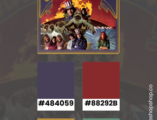
I updated the classic 80s brown, burgundy, and hunter green with a slightly muted variation.

A natural skin tone (#dbcdc9) and rich blush (#d7b5c4) offer a visual break from these intense colors. Together, they feel nostalgic without looking dated.
Harvest Moon Palette
Inspired by the glow of an autumn moon, this group offers variations on yellow and gray.

Two tans (#e7cdae and #d3d3d9) layer perfectly for a subtle combination of backgrounds. Against these golden yellow, smokey gray, and warm black highlight interactive design elements. Alternating between these intense tones for hover states can add an intriguing effect.
Kiss from a Rose Palette
The clash of red and green is a mainstay in horror visuals (from Freddy Krueger’s sweater to the scenes in Susperia (1977)).

These tones bring different levels of saturation to alternating red and green options. This creates classic, yet unexpected, visual options like a dusky pink atop a calming sage. Deeper versions work well for interactive elements and hover states.
Spell on Your Color Palette
This group of golden brown tones evokes the calm of candlelight.

Instead of relying on purely yellow tones, these colors create the feeling of flame against natural wood. Smokey gray (#d3d3d9) pops against the dark browns. Interactive elements and hover states can contrast the light colors with the dark options.
Stay Inspired
Follow me on Pinterest to see my latest color palettes. I’m always pinning options for new website designs.


