Product Photos from clients of The Shop Shop
Lately, I’ve seen the same two variations in the colors I choose for designs. First, I find myself subbing out a blue-black for a straight black. Second, I have been swapping oatmeal tones for white. Combined, they have a classic look that reminds me of knit sweaters.
Sweater Weather Aesthetic
The plush texture of a cozy sweater remains one of my favorite cold-weather sensations. That exciting sensation inspired each of the color combinations below.
Undone Website Colors
For this color grouping, I chose a subdued, hipster palette. You can imagine these tones hanging on racks at a thrift store.

The blue-black complements the marsala and pumpkin shades. I would use these for text, interactive elements, and hover states. The softer blush and tan tones work well for overlays and backgrounds.
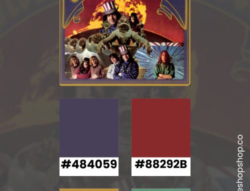
Autumn Sweater Website Colors
This group celebrates 90s sweater colors, just a slight slant from primary hues.

By using green as a bright base, the tan pops for text. These bold combinations would work well for an off-beat retail website or a music label. Both the yellow and purple options can create interesting hover states that invoke rugged energy.
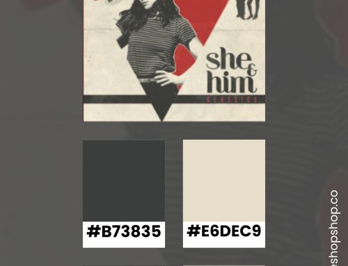
Poorly Knit Website Colors
For brands that wish to be grounded in the past, this grouping of colors relies on classic tones.

The blue-black, ashy brown, and maroon shades remain readable against the blush background. The brighter blue adds lovely accents in key areas like alert bars or a pre-footer,
Cardigan Website Colors
I brought all the soft sweater tones together.

For an unexpectedly dulce-de-leche vibe, I used the deep ochre for both the main background and the overlays. The warm gray option is still highly readable against this deep hue. For interactive elements, try out the spicy brown and warm blush colors.
Stay Inspired
I often post color combinations to my Pinterest board (with hex codes). Make sure you follow it to see the latest color inspiration.