What young writer doesn’t make their own zine (by hand with paste, staples, and scrap paper) at least once. I wanted to capture that raw, creative energy in a series of quirky color ideas.
Zine-Inspired Color Combinations
I started each of these designs with a really great option for black and white. Then, I based the accent tones around the complementary tones for text and background.
My Generation Colors
Shades of orange interlock in this tasty color palette.

I chose a warm white and a warm black as the base colors. Three options for orange accents work together for accent areas like feature boxes, menu bars, and article dividers.
Two Birds Colors
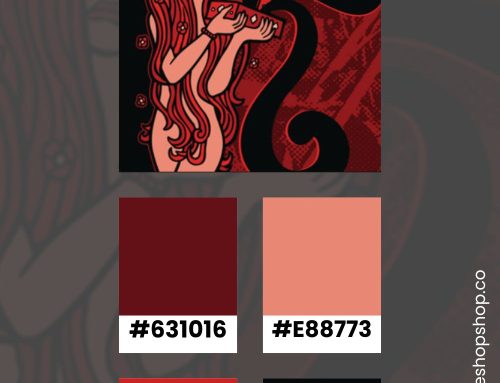
Like a cherry chapstick kiss, this color group is saccharine and fun.

The white is actually a light lavender. When you layer the yellow, peony, and rose tones on top, the resulting colors are perfectly sweet.
Nights With You Colors
Grunge takes a moment with this moody palette.

I chose a slate gray, rustic plum, and rainy blue as accent colors for this cloudy design. They blend nicely into the light gray background without making the design overly dark.
Hot N Cold Colors
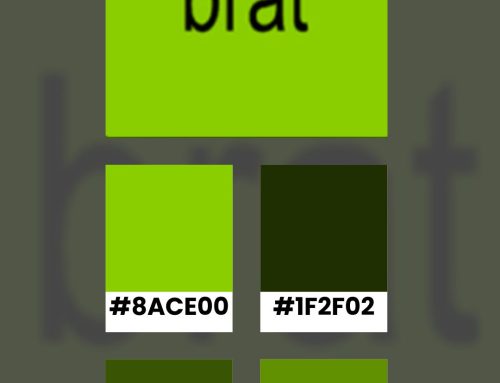
Green keeps grounding my designs.

Starting with a soft gray background, I layered photo-negative shades of green and red. They alternate between light and dark for a classic darkroom aesthetic.
Crazy in Love Colors
I can imagine poetry popping from this color group.

Soft purple, rustic blue, and light sage accent this clean color combination. The simple gray background and classic black text keep the focus on the story.
More Color Ideas
Find more color combinations when you follow me on Pinterest. I regularly post color combinations with hex codes. You can use them to inspire your next website design project.