If you look at branding in the food industry, red dominates the visual landscape. Years ago, color studies established red as a tone that stimulates appetite. The concept stuck in practice, brands leaned toward this in their logos, and interior designers added it to layouts for restaurants. Bright or primary red tones, in particular, constantly popping up in food advertisements.
The photo receptors in your eyes are particularly sensitive to long wavelength light, which we see as red.
“There’s an incentive to make logos red because red is the most visible color,” says Bevil Conway, a neuroscientist and artist with the National Eye Institute. He and other researchers have studied how color translates across languages.
“There’s overwhelming evidence that red is a special color,” Conway explains. “Of all of the colors, around the world, in all of the world’s languages, we communicate red most efficiently.”
This Is Why So Many Logos Are Red, Jen McCaffery, Reader’s Digest
Fast food chains are best known for this — as they use the “Ketchup and Mustard” color theory of pairing yellow and red. The bright tones are paired together to stimulate appetite. But, it’s also associated with low-value and unhealthy products. Not exactly a high-end vibe.
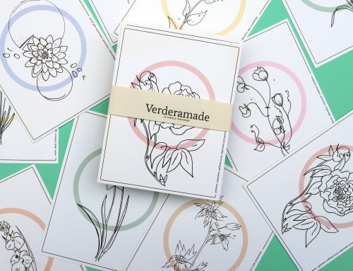
Whenever I photograph food-oriented products, I look for fresh ways to pair red. Lately, I’ve been using tones of green to signal health and freshness. Pairing rich brick red with a forest green evokes a traditional, flavor-filled nostalgia. Mixing eye-popping magenta with mint green signals a millennial luxe experience. Watermelon red with aqua or seafoam colors captures that playful, technicolor feeling of beach-movies and retro summertime activities. Think diners, drive-ins, picnics and pick-up games.