I wrote about the 2020 Pantone color of the year, Classic Blue, with a yawn. Although we could have used more snooze-inducing moments (in a year that turned unprecedented into a punchline), I’m still unenthused by the tone. Pantone chose this “reflective” and “resilient” tone to bring a sense of peace, trust, and refuge.
Instilling calm, confidence, and connection, this enduring blue hue highlights our desire for a dependable and stable foundation on which to build as we cross the threshold into a new era.
If it feels political; it probably was. I called it “…a very usable, if somewhat forgettable color”.
I’ve pulled the color up for a few traditionally-minded clients in staid industries. It’s that steady blue in almost every corporate logo since the dawn of 4-color printing.
It makes me wonder, if they could choose again, would the Pantone design team pick differently?
When I think about the actual colors that dominated 2020, that awful red coronavirus rendering comes to mind – a clinical grey sphere floating in a sea of threatening grey. Between alerts from the CDC, visual artists took a turn toward escapism with designs and color combinations that featured fantasy, nostalgia, and freedom of spirit.
Maximal Green
Although deep greens had been dropping into luxe designs for a few years, they took a maximalist turn in 2020. I noticed it most alongside complex textures and rich patterns — as well as equally strong reds and browns.


Warm woods, in addition to golden metals, elevated the tones to something meaningful. The resulting aesthetic reminded me of historical interiors.

Insta-Collage and Peachy
Born from the ground up, this orange-peach tone reminds me of golden light on summer skin. The aesthetic — pretty-meets-gritty — reminds me of accidental art.
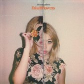


The vibe is experimental — like a doodle on the back of a notebook before you commit to a full sketch.


At the same time, orange and teal filters became a popular way to enhance our shut-in summer.

Pop of Red
I also noticed pops of red in a lot of designs, often against hugely-stylized photo treatments.


Organic Neon
Finally, neon tones — often with a pulpy and retro, science fiction style — brought together the organic shapes of nature with unexpected technicolor.


While Classic Blue played a role in 2020 — it was not (as the kids started saying) the main character. It worked fine as a new neutral, and you still see it in color palettes as a supporting tone. Yet, I would argue neo-vintage shades of red and orange had a larger impact.
Like Talking About Color?
If you enjoy talking about color, check out my Facebook page. I post new color combinations weekly with hex codes (to make them easier to pull for your digital designs).

