In a world of stylized, dramatic makeovers, this black-and-white home office makeover appears underwhelming. It’s meant to be. I wanted a space that focused me back on my work and left a little room for inspiration. So, last December, I took the holiday break to tear the room apart.
We tarped, painted, decluttered, and put it back together. Parts of it are still in progress but, I’ve enjoyed the process so far.


Black and White Home Office Makeover
I love color but, I have a hard time committing to color. There are themes in the tones I like, of course. Yet, I find myself leaning toward neutral tones for the big pieces and adding pops of color to delight myself as the seasons change. So, I opted for a simple black-and-white treatment for the walls.
I would have been tempted to do floor-to-ceiling black. But, I avoided this for two reasons. First, I use this space as a photography studio. So, it’s convenient to have stretches of white to reflect light. I even kept one whole wall completely white in case I need it for photos. Second, this is in a basement. Obviously, I have luxurious daylight steaming in from walkout double doors and a ground-level window. But, it’s actually fairly shaded. I wanted to have enough white to bounce the indirect light around on the darkest days.
For the top, I chose a neutral white. It’s so much crisper than the dingy grey that I covered. For the bottom, a soft matte black adds a chic and moody element. I also added two pops of lavender. First, I used it inside the window frame. Second, I painted a small accent wall that cuts out into an awkward space.
Since I lean toward warm woods and eclectic, vintage decor items, this black and white paint combination grounds everything visually.

The slightly higher-than-chair-rail black line gives the room the right energy. I also like the way all the warm woods pop against it. And the new, shag carpet that we inherited blends pretty well into it. (I’m too cheap and eco-conscious to replace this newly-installed carpet).

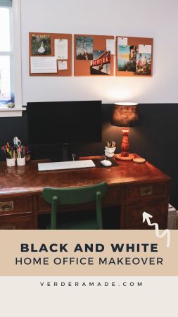
I picked up my desk at a Thrift store in Roanoke, Virginia. It’s probably the heaviest piece of furniture I ever owned and it cost me $40. Pound-for-pound, it was a deal I couldn’t resist. My desk chair is from IKEA and is probably the most comfortable option I’ve ever had. I was considering it as a dining room chair and ordered one. I went with something else for my kitchen table but, adopted this wide-seated, sturdy seat for my desk. Beside my desk, I have closed storage in IVAR cabinets. I actually put legs on them before that was a thing. Inside, I store files, some craft kits for my son, and a lot of unsightly photo props and supplies. It’s controlled chaos but, I can shut the doors and ignore it.
Above the cabinets, I hung a few simple shelves that I got at my local Goodwill. I wanted a place to store photo prop greenery where they wouldn’t get crushed. That old monitor is painted and covered in the corkboard. It’s a display piece that I bring to festivals where I sell my greeting card line. The lamp is actually from my childhood bedroom. It’s a ceramic carousel horse that my aunt painted for me. I switched out the shade and thought it looked quite kitschy alongside the masculine elements in the room.
On my desk, I have an old handmade lamp (another goodwill find), that I rewired. The lampshade is temporary and I might swap it out for something more interesting (or a bare bulb). I actually dislike most of the pen and brush storage on my desk. But, I have yet to find a perfect solution. Right now, I’m keeping an eye out for an interesting, industrial piece that I can reuse.

Changing the overhead lighting made the biggest difference in the project. Before, there was a single, overhead bulb in a glass dome and a fan that didn’t work. I replaced both with these exposed-bulb fixtures for a total of 16 bulbs on the ceiling. Even at night, I feel motivated to get work done.
Corkboard was an essential part of the plan for my desk space. I am always adding inspiration and rearranging the items. I art journal as part of my creative process. Sometimes, the elements spend time in front of me before I commit them to the page. Also, I tend to pin inspiration when I’m working on a large project. Brand guides or website designs tend to immerse me for weeks. I like seeing the elements in front of me while I work.

Now, I can add little colors into the mix as I’m feeling it. The corkboard above my desk, on the cabinets, and next to my photo space give me room to mull over color palettes and collect inspiration without committing to color on the walls.
Gray Walls to Clean Black and White
In Lynchburg, realtors recommend painting homes that particular shade of dove gray that made the rounds in the early 2000s. It’s still popular here as a neutral and I kind of loathe it. It’s overdone in this area and home shopping revealed the pervasiveness. My entire house was painted one tone of gray. While it’s neutral, it looks really dingy. Plus, it clashes with all the warm tones in the house. Most of the fixtures and carpets are warm or white. I’ve been slowly replacing it room by room.
This basement office shines now that clean white has replaced the gray. Seriously, the white bounces the light and it feels so much brighter.
Pops of Lavender
I chose pops of lavender as the core accent in the room. Alongside this, I added mossy green tones and some duck egg blue in the space. While they aren’t exactly trendy (and clash with my business brand colors), they recall my childhood. Lavender was my favorite color starting with a declaration when I was three years old. It tickled my mom, my grandmother, and any adult who heard my precocious color preference.
In stride with that, I adored the emerging Shabby Chic aesthetic. I grew up with a penchant for lace, watercolor, peeling paint, and the patina of antique stores. While that’s not my whole aesthetic, there is something about it that still appeals to me. An authentic leaning toward old, pretty things with a humble provenance. I just like tawdry junk.
I need these colors to remind me of where I come from as an artist. Something else would be cooler, for sure. But, this makes me think of the little girl that would be pretty proud of my creative career.

Like many basement spaces, there are quirky alcoves like this one. It’s about ten feet wide and sits back less than three feet from the rest of the room. I painted a lavender accent wall in the space. Then, I made a simple loveseat from wood we already had in storage. The seat is actually my son’s old crib mattress. I made the pillows from old pieces of embroidered fabric.
Above it, I hung several items that I already had from years of switching spaces. The posters were a lightweight art solution for apartment living (they could hang from 3M hooks without damaging the walls). The embroidered ships were a find from my Nana’s basement, a long-ago craft project. the candlesticks were roadside finds that I couldn’t resist. Yes, I pick trash from curbs on occasion.
There’s still a little “dead spot” in this gallery wall. I want something round or oval to fill that space. I’m keeping my eyes open for it at my favorite thrift and antique stores.

Decluttering and Reorganizing
While I tore apart the room, I also decluttered and reorganized. The wooden shelf moved to another corner, along with many of the books. This new metal shelf from IKEA is lower and I can fit my greeting card racks on top. It also has more dedicated space for photography and art supplies.

I tried to keep DIY projects to a minimum for this room. The list can grow so fast. But, I did makeover this lamp for the space. It was a little chippy but, I loved the shape. So, I painted it a warm, copper with texture. It really sings from the corner of the room.

A Place to Work
This corner is the workhorse of my space. I shoot product photos for my clients here. Just painting the nearby walls bright white has made my photos brighter. But, I also made some more room and added storage. It’s so much easier to set up and leave up if needed.

While it’s not the most aesthetic corner, it’s the one that pays the bills. I have everything nearby that I need and plenty of room to move around.
Overall, I’m pleased with how it turned out.
Did you like this post?
Find more design inspiration by clicking through to my blog archive. I regularly post about trending colors, font combinations, photography tips, and design ideas. I also post about my projects on Instagram and Pinterest.
About Me
My Name is Danielle Verderame. I’ve combined my experience writing for publications with my conversion-focused content marketing skills. I’ve been helping organizations and individuals find their voice since 2008. I’m a writer — with a command of design (graphic + web), photography, online tools, and strategic planning.
In 2018, I formalized my freelance writing and marketing business by forming Verderame, LLC. in Lynchburg, Virginia. This brings together my experience writing for publications with my conversion-focused content marketing skills. Typically, I work with clients that are located in Central Virginia or have ties to the area. Proximity to clients facilitates a rich and authentic narrative with messaging, photography, and design elements that match your brand completely.
I rarely outsource work on projects. However, I do maintain a network of professionals in my industry. So, I have people that I can trust to come alongside me if your project or timeline necessitates additional creative talent. In these cases, I closely supervise their tactics.
My services focus on WordPress websites (especially eStores) and search engine optimization. Related tactics include copywriting, product SEO, product photography, Instagram and Facebook branding. For over a decade, I’ve helped my clients expand their voices into new markets.