Unsurprisingly, Cyndi Lauper’s album cover art embodies the vibrant, playful persona of her music and stage presence. The bold tones often contain high-contrast red/blue combinations that are almost dissonant to the eyes.


Although the prolific artist’s career has spanned several decades, with an undeniably distinct sound, Cyndi Lauper’s style is most synonymous with 80s alt or playful punk aesthetic. Her look is often referenced in any work affiliated with that time.
The 1980s were a vibrant decade marked by bold colors, extravagant fashion, and a spirit of innovation. That visual rebellion permeated every aspect of culture, from music and movies to technology and design. For graphic designers looking to infuse their projects with a touch of retro flair, the 1980s offer an endless well of inspiration.
Bold Colors and Geometric Patterns
One of the most defining features of 1980s design is its unapologetic use of bold, bright colors. Neon pinks, electric blues, and vivid greens were staples in everything from fashion to graphic art. These colors can be employed to evoke a sense of nostalgia and energy in your designs. Pair these vibrant hues with geometric patterns—think zigzags, grids, and abstract shapes—to create dynamic compositions that draw the eye. The juxtaposition of sharp lines and bright colors can make your designs pop, much like the album covers and posters from the ’80s that continue to captivate audiences today.
Retro Typography
Typography from the 1980s was as bold and varied as the color palette. Fonts were often chunky, with exaggerated serifs or sans-serif styles that screamed for attention. Consider using typefaces reminiscent of arcade games, VHS covers, or even the iconic “Miami Vice” logo to give your project an authentic ’80s vibe. Combining these retro fonts with modern design principles can result in a unique blend of old and new, offering a fresh take on a classic style. Don’t be afraid to experiment with text effects like glows, shadows, and gradients to enhance the nostalgic feel.
Pop Culture and Technology
The 1980s were a golden age for pop culture, with the rise of iconic movies, music, and video games. These continue to influence contemporary design. Think about incorporating elements from sci-fi classics like “Blade Runner” or “Back to the Future,” or the pixel art style of early video games. These references can serve as a rich source of inspiration, providing familiar touchpoints for audiences. Just put your own creative spin on them. Additionally, the burgeoning technology of the ’80s, such as early personal computers and synthwave music, offers a retro-futuristic aesthetic. Use these to add a unique edge to your designs.
Yet, Lauper’s cover designs have more nuance than derivative 80s designs. They’re a little bit gritty — with shades of brown to keep them from the complete candy colors of jazzercize aesthetics.
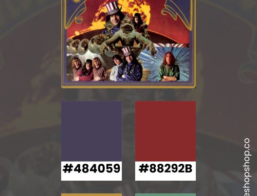
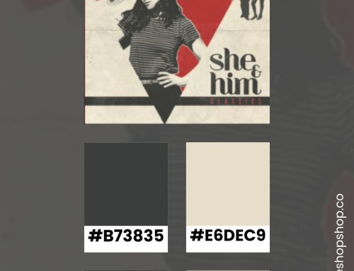
Color Combinations Inspired by Cyndi Lauper’s Album Cover Art
While I worked, I listened through her discography. As I moved through each album, I pulled tones from the cover art to create each color combination. If you’re looking for retro inspiration, you can harness the iconic colors of her cover art to create striking and memorable designs.
She’s so Unusual

True Colors

A Night to Remember

A Hat Full of Stars

Sisters of Avalon

At Last

Shine

The Body Acoustic

Bring Ya To The Brink

Memphis Blues

Detour

Stay Inspired
The 1980s offer a plethora of inspiration for graphic design projects. You can create designs that are both nostalgic and innovative. Embrace the bold colors, geometric patterns, retro typography, and rich pop culture of the era. Exploring the nuances of Lauper’s style will keep you from looking like a Stranger-things spinoff — and more like you were actually there. If you enjoyed this color inspiration, visit my Pinterest profile. I regularly pin color combinations with hex codes.