Is there anything more twee than She & Him? This musical duo, consisting of Zooey Deschanel (vocals, piano, ukulele) and M. Ward (guitar, production), formed in 2006 and released their first album, Volume One in 2008. Their sound blended with the indie-folk resurgence of the mid-2000s. It’s whimsical and earnest easy-listening that brings me back to the coffee shops of my twenties. And I’m not the only one who is ready for it to come back. That’s why I created these color combinations inspired by She & Him album cover art.
Color Combinations Inspired by She & Him Album Cover Art
The first time around, twee was controversial — like many popular trends. Some people saw it as a little silly and performative. But, it had a chokehold on many — with the “adorkable” Zooey leading the charge.
The word twee started life meaning pretty or nice and derived from the sound a small child might make when attempting to pronounce the word ‘sweet’. In the UK the word became “chiefly derogatory” according to OED, meaning “excessively affected, quaint or sentimental”, and has since been reclaimed and redefined in the US by the indie-music scene.
Of course tweeness of any sort remains polarising – what is endearing for some is toe-curlingly cloying and sickly for others – but love it or loathe it, there is now no escaping it. What began as a niche aesthetic with a cult, fashionista following has grown rapidly, with pioneers such as Miu Miu, Markus Lupfer (king of the kitten-embellished knit) and Meadham Kirchoff attracting an increasingly devoted following. And whimsical, fairy-tale enchantment is a big story in fashion this autumn, from Dolce & Gabbana’s golden silk hoods and dresses adorned with woodland creatures to Saint Laurent’s Little Red Riding Hood capes. – Lindsay Baker, The rise of twee (2014)
Visually, it was very accessible and repeatable. You could search vintage stores for old records and dusty lace at any price point — to curate aesthetics that felt original even while riding the wave of a rising trend. And now, millennials are revisiting this playfulness to brighten us up from the dim, post-covid gloom.
If Tumblr defined an entire generation with ripped tights, messy liner, Dr. Martens, and the idolization of icons like Skins’ Effy Stonem, then twee was its feminine, artsy sister that peaked in 2014. Oversized collars, printed A-line dresses, Mary Jane flats, colorful tights, and layered cardigans built the bulk of twee, with Zooey Deschanel standing in as the unofficial queen while Wes Anderson movies and indie music flew high as the unofficial flags. – Kristen Bateman, Unpacking the Twee Fashion Craze Taking Over TikTok
Since its revival in 2022, twee has filtered back into the conversation and encouraged people to look back to the inspiration for the inspiration.
Twee is trending on TikTok thanks to the millennials who are reminiscing on the days they originally rocked the aesthetic. Those who are partaking in this walk down memory lane are using She & Him’s song, “Why Do You Let Me Stay Here?” as the soundtrack behind their twee-era OOTDs.
Fans also claim that actress Zooey Deschanel (who is literally the “she” of indie music duo She & Him, BTW) pretty much carried twee on her back as she starred as Summer in (500) Days of Summer and Jessica Day in New Girl. She even took part in the TikTok trend herself and mentioned that the app taught her what the word means. Honestly, this is quite the journey we’re on. – Samantha Olsen, All the Tea on Twee, the Aesthetic That’s Resurfacing on TikTok
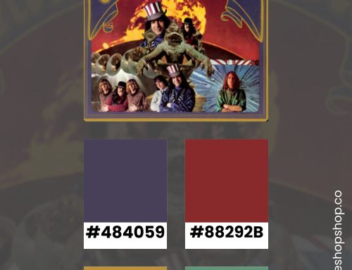
Ever-ready to wend back down a memory lane, I decided to listen through all of the She & Him albums while I pulled color combinations from their cover art. I skipped over their holiday compilations for this roundup. Throughout their designs, you can see a nostalgic nod to retro graphic design and photography that echoes the style of their music. One thing they do extremely well is preparing the listener with visual hints from 1950s and early 1960s graphic design.
Volume One

Volume Two

Volume 3

Classics

Melt Away

Using 1950s Record Cover Art as Graphic Design Inspiration
The 1950s marked a golden era in music history, with genres like rock ‘n’ roll, jazz, and rhythm and blues taking center stage. However, it wasn’t just the music that left a lasting impression. The record cover art of the 1950s stands as a testament to a time of bold experimentation, vibrant colors, and innovative design. Today, as we see a resurgence of vintage aesthetics in modern design, 1950s record cover art provides an abundant source of inspiration for artists, designers, and enthusiasts alike.
One of the defining characteristics of 1950s record cover art is its use of bold, striking typography. Designers of the era weren’t afraid to experiment with various fonts, often combining multiple styles on a single cover to create a dynamic and eye-catching visual hierarchy. This approach can be a breath of fresh air in today’s digital landscape, where minimalism often dominates. By incorporating retro typography into modern designs, whether for branding, posters, or digital media, designers can evoke a sense of nostalgia while also creating something that feels fresh and unique.
Another key element of 1950s record cover art is its vibrant color palettes. The 1950s were a time of optimism and exuberance, reflected in the bright, contrasting colors used in album covers. These palettes often featured bold primary colors, pastels, and even neon hues, creating a lively and energetic visual experience. Modern designers can draw inspiration from these color schemes to inject a sense of playfulness and excitement into their work. Whether designing a website, an app, or a physical product, using a retro-inspired color palette can help create an engaging and memorable user experience.
Lastly, the illustrative styles and imagery of 1950s record covers offer a treasure trove of inspiration. From abstract geometric shapes to detailed hand-drawn illustrations, the art of this era was incredibly diverse and imaginative. Incorporating these styles into contemporary design projects can add a layer of depth and creativity that sets them apart. For instance, using hand-drawn illustrations can add a personal touch to branding materials, while abstract shapes can create visually interesting backgrounds and layouts.
When you look through She & Him’s cover art, you’ll see nods to this era — with a twist.
Stay Inspired
The record cover art of the 1950s provides a rich well of inspiration for modern designers. By embracing bold typography, vibrant color palettes, and diverse illustrative styles, we can create designs that are both nostalgic and innovative. So next time you’re looking for some creative inspiration, take a trip back to the 1950s with a cross-reference to the early-2000s indie scene. You never know what you’ll uncover.
If you enjoyed this color inspiration, visit my Pinterest profile. I regularly pin color combinations with hex codes.