verderamade

About Danielle

I am a writer first.  I specialize in content-heavy websites, bringing my 15 years of professional communication experience and my imaginative aesthetic to create a Virginia Marketing Agency. Most of the time, I optimize small business websites for search and social media to generate more traffic — and more sales.  As inspiration strikes, I generate lifestyle or educational content for publications. Most of it focuses on small businesses, supporting local initiatives, creative inspiration, and communication or marketing theory. 

Spring Color Ideas for Graphic Design Projects

By |2024-03-28T14:46:59-04:00February 29, 2024|Graphic & Print Design|

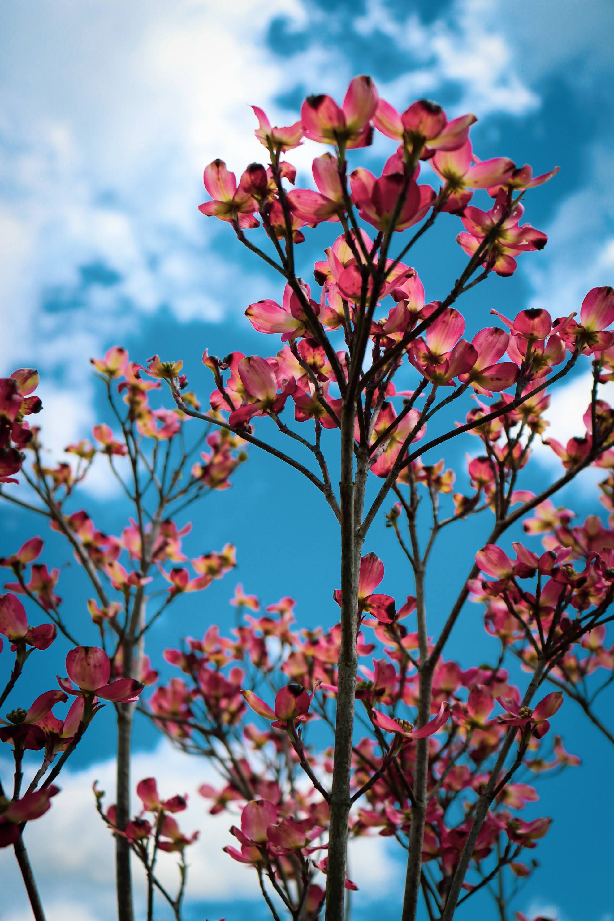
Spring is a time of renewal, growth, and vibrant colors. So, it's the perfect season to infuse your graphic design projects with fresh and lively hues. Incorporating spring colors into your designs can evoke joy, optimism, and energy. A few strategic color changes can bring new life to you designs. Enjoy these spring color ideas for graphic design projects from a Lynchburg Advertising Agency. Spring Color Ideas for Graphic Design Projects When using spring colors in graphic design projects, think about incorporating pastel shades like soft pinks, light blues, and gentle greens. These colors signal tranquility and serenity. They convey [...]

Summer Color Ideas for Web Design Projects

By |2024-03-28T14:47:43-04:00February 29, 2024|Graphic & Print Design|

Stay inspired with these summer color ideas for web design projects from a Lynchburg Marketing and Website Design Agency. The Role Color Plays in Website Design Color is one of the most powerful tools in a designer's arsenal for creating engaging and visually appealing websites. The role of color in website design goes far beyond aesthetics. It can evoke emotions, convey brand identity, guide user behavior, and influence decision-making. Colors connect emotions to visuals. For example, warm colors like red and orange are associated with energy and passion. However, cool colors like blue and green create a sense of calm [...]

I listened to all of Ariana Grande’s discography and created color palettes from her album covers

By |2024-02-28T09:18:29-05:00February 28, 2024|Graphic & Print Design|

Next on my list, I listened to Ariana Grande's discography and pulled color inspiration from her album covers. For her first few albums, the designs featured black and white images with a restrained color palette. Later, the designs added neutral, nude tones with some soft, pastel accents. As a whole, the covers are a solid source of safe, crowd-pleasing colors. Stay inspired with these color combinations from my Virginia Marketing Agency. Ariana Grande's Discography I listened to all of Ariana Grande's discography in order and these are the songs I added to my playlist. Yours Truly (2013) Better Left Unsaid [...]

I listened to Beyoncé’s discography and pulled colors from her album covers

By |2024-02-27T15:20:06-05:00February 27, 2024|Graphic & Print Design|

Next on my list, I listened to Beyoncé's discography and pulled color inspo from her album covers. Interestingly, all the covers with Destiny's Child bore a visual similarity — simple monochromatic backgrounds and coordinated outfits. By contrast, Beyoncé's solo albums illustrate the creative journey of the music within. So, the colors vary greatly for each album. Overall, earth tones — like khaki and tan — are the most consistent elements. I listened to Beyoncé's discography With Destiny's Child Destiny's Child (1998) Killing Time Illusion Sail On The Writing's on the Wall (1999) Confessions Say My Name Survivor (2001) Happy Face [...]

I listened to Jewel’s Discography and Created Color Palettes from her Album Covers

By |2024-02-16T11:29:01-05:00February 16, 2024|Graphic & Print Design|

The first three albums were what I expected from Jewel. I knew many of the songs and the sound of the unfamiliar tunes didn't surprise me. By contrast, the title and cover art for 0304 surprised me. It was very 2000s pop in style and content — with song titles like Run 2 U, 2 Find U, and 2 Become 1. With Goodbye Alice in Wonderland, her songs returned to her folk and country roots. I listened to Jewel's Discography in Order These are the songs I added to my playlist. Pieces of You Who Will Save Your Soul I'm [...]

Groundbreaking Floral-Inspired Color Palettes for Spring

By |2024-02-15T14:08:06-05:00February 15, 2024|Graphic & Print Design|

Miranda Priestly may not approve but, spring florals often inspire color palettes. From bright tulips to soft, pastel buds, the blooms ground unexpected tones in earthy browns and mossy greens. Floral-Inspired Color Ideas Take a trip through any nursery or greenhouse and you'll quickly find colors that can bring your spring designs back to life. Designers often overlook classic blue colors for spring — as shades of pink catch the eye. These pansies provide a lovely mix of deep blue and purple tones. I'm always looking for lovely neutral tones — which spring buds and branches are quick to provide. [...]

New Freebies: 5 Adobe Lightroom Presets

By |2024-02-15T08:49:00-05:00February 15, 2024|Lifestyle & Aesthetic|

Years ago, my website held a freebies page — filled with phone wallpapers and downloadable graphic elements. I always dreamed of expanding my free resources to include helpful tools for eStores, shops, and makers. The first step to bringing back my freebies? Free Adobe Lightroom Presets. Free Adobe Lightroom Presets Although I plan to expand this at a later date, I started with a few essential presets. These presets offer aesthetics that my clients regularly request for their product photography and social media content. Vintage Haze Adobe Lightroom Preset DOWNLOAD This preset works well for brick-and-mortar stores. It softens the [...]

Cool Industrial Colors

By |2024-02-15T08:33:52-05:00February 15, 2024|Graphic & Print Design|

Sweaters with sundresses, bulbs peaking through snowbanks, and the sun shining through bare branches herald early spring. It's a time when the eyes search for anything to break up the gloom and gray. Early spring holidays range from gleeful to garish. And patina has its moment. Cool, Industrial Colors Lately, I've been noticing cool, industrial colors as the bare landscapes draw the eye to the bones of winter. Rust pops and patina beckons. Below are a few color combinations I created to embrace this chilly, yet hopeful, time of year. If you liked this post Follow my Color [...]

Plenty of Colors in the Sea: Living Coral Pantone Color of the Year 2019

By |2024-03-28T14:48:21-04:00February 13, 2024|Graphic & Print Design|

Several years ago, my mom asked me what she should use as a second accent color in her living room. She had already painted the walls a bold blue so, I suggested coral. You can see why that color combination feels fresh. It's inspired by nature — and totally tropical. Living Coral Pantone Color of the Year 2019 When Pantone named their color of the year for 2019, designers were intrigued by the tropic-inspired tone. In reaction to the onslaught of digital technology and social media increasingly embedding into daily life, we are seeking authentic and immersive experiences that enable [...]

I Listened to Taylor Swift’s Discography and Created Color Palettes from her Album Covers

By |2024-02-06T13:49:15-05:00February 6, 2024|Graphic & Print Design, Lifestyle & Aesthetic|

Previously, I posted about how Taylor Swift's re-release of "Red" rekindled the discussion about unapologetic femininity. That controversy around her re-recording of masters and the conversation about being allowed to love her work, made me listen to her entire discography in order of release. I was aware of her work and her profile only as someone who pays attention to trends and media, not as a fan. Now, I'm revisiting all of her albums to pull color palettes based on her cover art. Taylor Swift These playful, tropical colors are perfectly 2000s. Fearless and Fearless Taylor's Version The sepia treatment [...]

Go to Top