


Whether you have a brick-and-mortar shop or sell exclusively online, several key marketing principles can help you build a retail website that makes customers buy. The process starts by understanding how to sell online versus in person. Once you understand the philosophy behind selling, you can anticipate your ideal customer’s behavior and create a retail website that leads to more sales.
In This Article
1. How to Sell Online Vs. In Person
2.How to Build Website Content that Makes Customers Buy
3.How to Optimize an Existing Retail Website for More Sales
You may notice that I’m not endorsing a particular type of website (like Shopify, WordPress or Squarespace). For this post, I’m focusing on the basics of content and user experience (UX), not the technology that can support those principles.
How to Sell Online Vs. In Person
Imagine a great salesperson. They’re charming and friendly. They greet you as you walk in the door with the latest sale or inventory information– telling you to find them if you need anything. They don’t hover but, you can see them. Their vibe is good — no pressure.
If you have a question, they drop everything to help you. When you’re ready to buy, they tell you about the current offers and help you get the best value.
After you checkout, you almost feel like you made a new friend.
Your website should replicate that experience but, with UX (user experience) design instead of a human body and a physical shop.
The Consumer Decision-Making Process, Explained
Making your website into a vehicle for sales starts by understanding the consumer decision-making process. All high-performing retail websites are built around this theory.
The Basics
Sometimes referred to as the buying decision process, this is how people experience their purchase transactions — before, during, and after. It’s often viewed as a cost-benefit analysis and the main factors are how people review alternatives.
Since decision-making is a psychological construct, this is considered a pattern of behavior. It’s been studied by people in psychology, economics, and business for years.
Nobel laureate Herbert E. Simon claimed that decision-making was a vain attempt to be rational. According to his theory, these kinds of decisions are immensely complex because they consider many factors and review many alternatives. Also, he believed that people’s ability to process information is limited. He posits that we don’t make rational decisions most of the time, even if we’re trying to be logical.
Over the years, the concept has been applied to the buying process because businesses want to influence that process.
The Model
In 1910, John Dewy introduced stages to the process. These were expanded by Engel, Blackwell, and Kollat in 1968.
In general, these models follow the same phases. Some expand it to 7 or 9 sections.
- Need or Problem Recognition: A person recognizes that they have a need or problem. They identify what product can fill that need. This can be emotional, physical, psychological, or spiritual.
- Information Search: The person begins the search for information on that product.
- Evaluation of Alternatives: As the person searches, they find several different products, in different versions and from different sources. They review these and compare all of the differences.
- Purchase Decision: After they have looked at their options, the person buys something.
- Post Purchase Behavior: With the product in hand, the person evaluates their own decision. This can be positive, negative or a feeling of dissonance.
During this, the consumer is influenced by a variety of factors.
- Product characteristics
- Amount brands examined
- Number of sellers considered
- Amount attributes evaluated
- Quality pf external information sources used
- Time spent searching
This largely invisible process determines whether or not a prospective customer buys your product.
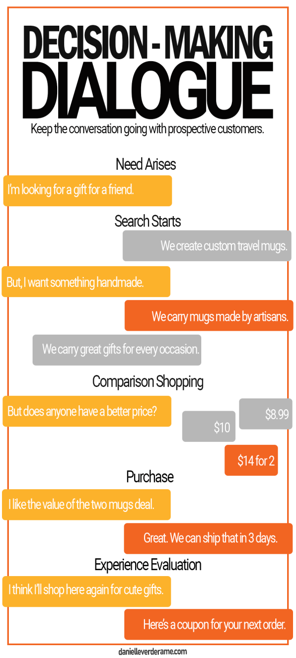
The Decision-Making Dialogue
I prefer to think of the process as a dialogue — especially when I’m putting together web content for a retail website. At each step in the process, you should anticipate the customer’s thoughts and answer their questions.
If you think about it, a lot of the first draft is common sense. You imagine the person who is purchasing the product and guide them from step to step.
Then, you go back through that draft and test it out. You can review it with other people or push it live in a testing phase.
The key?
Stay open to adjusting your content based on the feedback.
That’s the beauty of creating in a digital space. You can edit it in real-time.
In my example to the right, I show how your website, and competitor’s websites, can engage with a prospective customer.
As they search for information, you should be able to deliver useful solutions.
This is content marketing 101.
Make your content match the needs of your ideal customer.
How to Build a Retail Website with Content That Makes Customers Buy
When you create a website, the process should start by planning the content. I know it’s tempting to start by looking at a website design or theme. But even the most visually-oriented creatives will ask you questions about what you plan to put with the pages and the functions you need.
You start by sketching a site map — essentially a chart of the pages and files on your website. All of your content should be represented on this chart. (Once your website is built, you’ll create an actual site map to submit to search engines.)
It can be as simple as a spreadsheet listing parent and child pages.
PRO TIP: If you feel overwhelmed, start by thinking about your website’s main navigation bar. What would you put in that space? That can help you think about all the pages you need.
Then, plan what text, files and graphics need to go on each page. You can put this in a text document. I prefer a separate text document for each page. Sometimes, I even print them and put them all side-by-side to compare content.
After you plan the content, you must find a design that supports that content. Whether you’re doing a custom build or purchasing a theme, the content should drive that decision.
From there, you move into development where you actually build out each page on the website. This should take the visual elements, like graphics or text and marry them with the functionality of your website.
For retail websites, you must put emphasis on shopping.
Key Principles
Focus your design on ease of use for the customer. Buy buttons should be clear and easy to read. The cart and account information must follow normal protocols.
Stay aware of your page load time. Whenever you’re building an online shop, full of images and files, file size matters. Test your page load time and make sure everything is loading quickly.
Choose clarity over complications. Ideally, your customer should be able to add an item to their cart on the same page as where they view the item. Also, their cart should be easy to navigate to a purchase. If you make the process difficult, they’ll just move to a more user-friendly website.
Elements
The main navigation should emphasize “Deals,” “Shop”, and “Categories” pages. For the “Deals” page, list your current coupons, sales and offers. The “Shop” page should preview items. The “Categories” page must group your products according to the conventions of your industry. As you’re putting this together, look at websites for big online stores. People are used to shopping those websites and expect a similar navigation experience.
Retail websites use categories and tags as powerful ways to sort products. Put a lot of thought into this at the beginning. Then, as you enter each item, stick to your plan. This will make it easier for customers to search for your products.
As you put together individual product listings, keep the format consistent. I usually set up the most complex item first and use it as a template for all of the others. If a product does not have a certain part to the description, it can simply be removed. Similar to website navigation, look at product listings for big online brands. They all follow a similar format and yours should match.
- Product Name
- Price
- Buy Button
- Description
- Size and Specifications
- Materials
- Care and Cleaning
- Shipping and return information
- Reviews
Landing pages are a good way to create and advertise sales online. Since you have carefully categorized and tagged your items, you can feed them into a landing page using a pre-selected tag. The sale information should start at the top of the page with the applicable products directly beneath. Feature it prominently in your navigation and on the homepage.
One of the perks of online retail marketing is the Abandon Cart function. If someone fills up their shopping cart, but doesn’t purchase, you can nurture them toward a sale with offers. This practice is so common that customers expect it.
Adding a few online offers, like coupons or shipping deals, helps you incentivize a purchase. Trigger this to pop up appropriately, on specific products and in the customer’s checkout process.
How to Optimize an Existing Retail Website for More Sales
If you already have a retail website, there are several areas that you can optimize to improve your online sales. Make sure you have access to analytics for your website. It will help you spot areas of opportunity.
As you review your website, you need to look for the places where visitors leave your website. These are referred to as exit pages. If the exit is occurring before a sale, you need to research the reasons why they are leaving prematurely.
PRO TIP: You don’t need to be an expert in analytics to find some of these obvious issues. Once you’ve exhausted these areas, find an expert to help guide futher edits.
This is always a mix of audience, design, and content. Obviously, the website needs to function appropriately and look nice (design). Also, the information (text, photos, links, etc.) must push them toward a purchase. Finally, if you have a lot of traffic but low conversions, you may need to look at your marketing funnel to see what audience you’re bringing in.
On an existing website, you have a wealth of data to inform these decisions.
Key Principles
Your website should be goal-oriented, with all of the content supporting your main goal: sales. As you comb through the content, consider what content doesn’t support that goal. It may be a functional issue, like a form that doesn’t fill correctly. It could be an issue of design, like images that don’t represent your products well. Find these areas and improve them.
Online shopping is a user-guided experience. The “Behavior” tab in Google Analytics can give you some areas to spotlight. What are your main landing pages? Which are the most common paths from those landing pages? What are your top exit pages? Use this to start investigating what may be causing your prospective customers to leave before they buy.
Check your on-page time to see how long prospective customers are engaging with the page. If your on-page time is low, especially if it is less than 1 minute, you need to rework your page. It could be loading slowly (another metric to check.) Or the content could be turning people away. Or your advertising is bringing in the wrong person. Ideally, your average on-page time should be long enough for people to both absorb the content and make a decision- several minutes at least. Regardless, page time will give you a place to start exploring.
Elements
The images on your page should represent your content well and be optimized. This means that the details like file size and alt text must conform most recent standards for search and load time. From a design standpoint, they should be high-quality, well-lit, clear, and creative. They are the first impression of your brand, from the colors to the details.
The text on your page serves a dual purpose. First, it needs to provoke a response in the reader. Ideally, it will make them behave according to your call-to-action. Also, it is the main element that search crawls. If your text isn’t written with SEO in mind, your website won’t get picked up. This balance requires all of the words to be both well-written and written-for-web.
Ensure that your buttons and links function easily. If they don’t, it quickly alienates your user.
Build landing pages that focus on one activity, in this case, shopping a sale. Even if your individual listings are great, you’ll miss an opportunity if you don’t group them together. This of it like a sales display at the front of a store.
How to Build a Retail Website that Makes Customers Buy
To maximize your online sales, try working through each of the tips above. This will help you understand how to build a retail website with your customer in mind. The tips can help you make the most of your website traffic. Once you’ve checked these areas, find an expert to help you make additional areas. Also, if you’re looking for ways to get more at the top of the funnel, check out my pre-made retail marketing campaigns.
I’m here to help if you have any questions. Let me know about your latest projects in the comments.