My vision for every eStore I design — something striking that the customer will adore. This requires digging deep into the shop’s brand to develop an experience that draws their customer deep into the pages and products. These eStore tips will help you design a better website.
eStore Tips & Ideas
Before I start a wireframe, I walk my clients through the process of planning their content. It’s kind of the opposite of how many websites are created. Many people select a pre-made theme that they find visually appealing. Then, they try to collect images and text that will fit in the space.
Instead, I guide my clients through all the needs they have for their website — including content, integrations, and functions. Then, I design a custom website that accommodates all those needs.
Plan Your Pages
I ask my clients what pages they’ll need on their website. While they don’t need to have every bit of text and photos ready, it’s helpful to have a sitemap and a general understanding of any functions that will be needed on each page.
We may even choose to draw a wireframe for key pages — ensuring all the functions and content will be present.
Organize Your Products
Next, I ask my clients to organize their products. I like to know how many categories, subcategories, variations, and tags they’ll need. From the start, this helps you set up a shop that is easy for customers to navigate.
Design Your Brand
If you don’t have a brand guide, I suggest creating one before you start developing a website. You’ll need this design as it informs the colors, fonts, logos, and image style that will live within your website.
Invest in Visual Assets
Although it involves some additional up-front costs, your store needs visual assets to fill the website. Most of the time, this takes form in a photoshoot with staged photos of your store, staff, customers, products, and displays. Also, you’ll need a hi-resolution logo.
I don’t mind relying on stock images for backgrounds and textures. However, your design will look outdated if you have a low-resolution logo, pixelated images, or obvious stock photos.
Schedule Maintenance and Updates
Do you want to maintain your store in-house or use an external resource? The answer influences your design choices. If you plan on maintaining your store in-house then, you’ll want to use a theme and design your website in such a way that it can be easily updated with limited development experience. You don’t want to “break” your website when you’re trying to update the content.
If you plan on using an external resource, find out their rates to make updates. Some only work on a retainer. Others are willing to charge hourly for updates upon request. Some offer limited support without a contract. Make sure you find out the arrangement as this will influence the design.
For example, I recently rebuilt a website homepage to address this exact issue. My client had developed a website with an agency that discouraged client updates. They locked the client out of portions of the website — charging them a high hourly rate for simple text updates. Although this is actually fairly common in web development, my client had assumed they would be able to make edits in-house on a weekly basis.
I helped them rework their layout to something more user-friendly on the back-end of their website. Then, they were able to make content updates on their own.
From a time, money, and workflow standpoint, you need to plan your process for making updates before you design a website.
Most of my eStore tips can help avoid a redesign at a later date.
My Web Design Style
My web design style tends to be minimalist mixed with my client’s style. It’s the design version of the Coco Chanel quote, “Before you leave the house, look in the mirror and take one thing off.”
I start with the client’s brand concept and work to simplify it visually. This ensures a modern, clean web design that will be highly readable and user-friendly on all devices.
Colors
Most of the time, I choose my core colors based on the feelings they evoke in consumers.
To start, I choose a neutral tone that acts as the base for my design. If I am looking for something light, airy, or minimalist, I pick a stark white or clean blue-grey. When I create a moody feeling, I chose a slate-grey, purple-black, or a dark brown. If my design needs to feel more organic, I choose a sandy tan or a warm grey tone.
Next, I look at the client’s products. I always aim to have the product pop against the design. So, the website needs to complement these colors and patterns while still drawing the eye toward these areas.
Finally, I choose accent colors that work with the client’s brand. If the client already has a brand guide, these tones are an obvious choice. However, I may change the saturation levels of the colors or the amount I use them, based on how we want the site to feel.
Fonts
If my client has a core font they use, I’m happy to include that in the design. If it’s a complex, or hard-to-read font, I may use it more as a text treatment in an image as opposed to a header.
Why?
First, websites need to use fonts that browsers can read. Second, people struggle to read certain fonts at a small size. As a site scales for mobile, the font needs to work. So, I often choose a simpler, complimentary font for headers and body copy that blends with your brand’s core fonts.
Hero
Trends for hero images change rapidly. Right now, sliders and videos are declining in popularity — mostly because they are annoying on mobile devices.
In fact, I start by planning my hero on mobile-first. I think about the impact the site should have when someone looks at it the first time on their phone.
ESTORE TIP:
Planning at the beginning lowers the number of redesigns during the development process.
Then, I work back from that to create something equally stunning on the desktop. If needed, I’ve also made two different hero sections that swap out by the device.
Personally, I like a hero that has a call-to-action right at the top. “Shop Now” works well for retail websites. Beyond this, I use this key section to set the tone for everything that follows. The background image, text, and format should be as arresting as any advertisement you see in the physical world
Landing Page Layout
On my landing pages, I look for ways to disrupt the boxy aspects of designing for the web. At the barest level, websites are built with columns and rows. Many designs make this obvious by simply building the site in stacked, horizontal, rectangle sections.
I always look for ways to break this up visually, creating a different visual flow from top to bottom.
Product Photos
More and more stores are adding a lifestyle shot or two into their product pages alongside the usual white-background images. Why? It’s great for social media. If you size them at 600 px x 900 px, they are perfect for Pinterest.
Lookbooks & Catalogs
Virtual catalogs and Lookbooks recreate the nostalgia of direct-mail at a much lower cost. You can develop these into an interactive .pdf or even a series of blog posts.
Collections
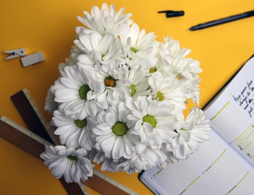
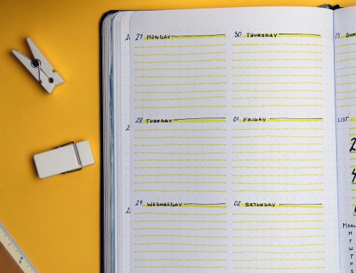
One of my favorite ways to differentiate products is by collections. Using this kind of grouping gives you a chance to create lifestyle-inspired moments within your images. Flatlays are a popular format for these groupings and work well overlaid with text on a website banner.
Models
More and more brands are ditching recognizable faces and going with models that look like everyday people. Often, they crop below the neck to keep the focus on the product. Also, you’ll find a lot of options for user-generated images. For example, Target allows users to upload a snapshot of themselves trying on a product from the dressing room.
Design a Better Website
Although it sounds like a lot of planning, this process yields a faster website development timeline. There are fewer redesigns and fewer obstacles when you make these decisions at the beginning. In the end, you’ll have a custom website — designed for your eStore’s unique needs.
If found this article useful, check out my other website design tips. In this section, you’ll find ideas to help you build a better online store.