If you feel like you’re in a design rut, try swapping out some of your backgrounds for fresh colors, patterns and images. You might be surprised how this one change totally refreshes your project. Below are safe places to find free backgrounds for your designs.
Where to Find Free Backgrounds for Your Designs
Make sure whatever backgrounds you use are licensed for commercial use. Otherwise, you’re stealing from the original creator. And if you’re not sure, just ask. Most content creators are happy to tell you and may even give you permission.
Unsplash
Unsplash images are licenced for commercial use and they are totally free. Often, I search “textures,” “backgrounds,” “close up,” or “patterns” to find images that I can use as backgrounds. They tend to stay current with trends. So the colors on the most popular photos are consistent with the latest aesthetics.
Pexels
Similar to Unsplash, Pexels offers free images. You just need to check whether they are licenced for personal or commercial use. They actually have a “background” category that features textures and intersted close-focus images.
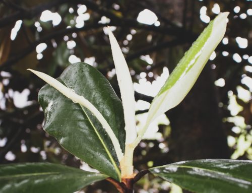
Photograph Close Up Textures
No matter the industry, you can probably find some interesting textures to photograph for your designs. Those colors and shapes are a part of the real-life experience of the brand. Try taking your own close-ups and filtering the images to your liking.
While you shouldn’t just use designs from Pinterest, you can use it like a search engine. Then, you can follow the images back to their source and see the licensing details. They are very good and giving you similar images in a search, which saves time up front.
Inspiration for Design Backgrounds
For a little inspiration, I’ve put together a list of some of my favorite background motifs. These really keep the focus on your text while signaling a distinct mood.

- Abstract Neon reminds us of the glam and opulence of the 1980s. It’s that old version of new money that dominated design during that decade. Whenever you add it to a design, you instantly recall the power and prestige of pre-recession consumerism.
- Dark Foliage twists the natural world into something elegant and confined. It’s mysterious and moody. For health-inspired designs that want to add some elegance without being too crunchy, this lighting trick creates a good balance.
- Saturated Galaxy always feels young and hopeful. We’ve been looking to the skys for inspiration for several years and the trend is still popular.
- Colorful Sand evokes the arts culture of the west. It combines trendy tones with natural elements for a festival feeling.
- Moody Hologram capitalizes on the 90s revival among Gen Z. We’ve taken a break from these effects for so long that they feel like classics.
- Marbleized Pastels keep pinks and purples from feeling too precious. Instead of using an expected peeling wood or floral background, try a marble tone. It’s totally 80s and ready for a comeback.
- Real-life Ombre brings the love of gradients into actual spaces. You can find these everywhere from wall art to product design. When you use them as a background, it feels urban and cool.
- 3D Patterns create a rich visual experience. In a world full of white boxes, they create a hand-made, timeless touch.
- Playful Shadows distort the shapes of relevant objects without completely removing context. In a design, it can bring in the curves of your setting in contrast to the neat rows of text.
- Subtle Cement layers well with any color. It adds some texture without overpowering the flow of your layout.
Each of these background ideas keeps the focus on your text while drawing the eye into the design.
Share and Save
If you enjoyed this post, make sure you follow me on Instagram and Facebook. I often share design ideas and inspiration, as well as, free graphics.