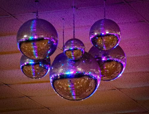
Glaring neon and bright pastels are the tones most associated with 80s inspired designs. While the Flashdance aesthetic did dominate certain designs, I remember an overwhelming amount of brown. From soft brown-black to dusty mustard tones, a lot of this decade revoled around variations on the chocolatey tone.
80s Inspired Designs
For this collection of colors, I recalled images that we see less now than during my childhood. Soda cans, vintage electronics and fast fashion fabrics came to mind. I pulled the feelings from these materials to create the color pallets below.
Ash Tray Color Palette
For this group of colors, I remembered how it felt to eat in restaurants filled with smokers.

Even when they started segregating tables by smokers and non-smokers, dining areas carried the tinge of tar and menthol. That off-white tone of a smoke-filled room inspired this group of colors. The peach and tan tones make an unexpected base for backgrounds and section dividers. The mustard yellow and deep plum add interest on interactive features of the design.
Floppy Disk Color Palette
Initially, technology focused more on function than form. Blocky casings and dull tones gave the earliest computers a utilitarian feel.

Now, I find the colors comforting — like walking in a small used book store. They’re warm and low contrast. The light gray and tan tones layer well with the green-ish grays to create visual interest. You can reverse them out to create something modern yet, nostalgic.
Members Only Color Palette
What is that great green? The 80s brought us many jungle-inspired tones that worked well with rich, rattan furniture, gold jewelry and other warm design elements.

This group of colors is built around the silky tones of a member’s only jacket as the light reflects of the soft ripples. A startling green #146f51 complements the mustard and sage tones. Dark green offers a substitute for black while pale peach offers a neutral background.
Taste for Life Color Palette
Soft drink advertising filled every available surface in rest stops, restaurants and gas stations. Billboards and store windows all featured the bold, contrasting blue and red of the big soda brands.

This color combination starts with the obvious blue and red (seen in so many big brands during this time). A greedy green works well with the cold grays. Overall, the effect is retro and bold.
Stay Inspired
Check out my Pinterest profile if you enjoyed these color combinations. I regularly pin colors with hex codes for website projects.


