Every website design relies on fonts to guide the reader through the text. This happens visually (with the font style, size, and weight) and is interpreted by the style guide. If you’re looking for ideas for website fonts, follow the guidelines below.
General Typography Rules
If your brand already has fonts that work for the web, you can use those. If you don’t have any brand fonts, you can set them in your style guide. Below are some general typography rules that impact website design.
- Select legible fonts. They should be easy to read in large and small sizes.
- Pick 2-3 total font options. You can add some variation by changing the font size and weight.
- Keep your brand’s personality in mind when you pair the fonts. A traditional serif header font can look more modern if you pair it with a sans serif font for the body copy.
- Use white space and text alignment to your advantage. Don’t crowd the information. On a website, you have limitless vertical space.
- Create entry points into the text using headers, pull quotes, indents, and drop caps. Encourage reading through your design.
My Top Tips
In regard to website fonts, I build upon general typography rules. These tips help you avoid frustration as you start implementing the fonts throughout your website content.
- Create a font hierarchy. It must work on every page of your site. I start by laying out the modules (ie. feature boxes, subscription forms, galleries, blog preview, etc) and creating page templates that include those modules. Then, I use this to make sure the assigned fonts will work. Sometimes, ideas that work in theory don’t look great when the modules are near each other.
- Lean toward thicker fonts if your modules include text over images and textures. Otherwise, readers will have a hard time seeing your text.
- Fix the line height in CSS. Many themes build in a default line height that looks awkward with less common fonts.
- Pick a strong secondary font. Whatever you use for H2-H6 will be everywhere on your site. Make sure you really like it.
Picking Fonts for your Website
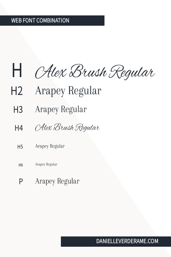
Create a hierarchy for the information on your website using clear typography. Ideally, Heading 1 to Paragraph will use the fonts (including the size and weight) in a logical order.
CSS Meanings:
- H1 is the first header for your website. On your homepage, this is often the text that goes on top of the Hero section. On other pages, you use this for the page title. It should only be used once on each page of your website.
- H2-6 are heading options used in order. Think of it as a writing outline. H3 goes under H2. H4 goes under H3 which goes under H2. Keep this in mind as you’re choosing the font family, weights, and sizes. Ideally, H2 will be larger than H3 and so on.
- P denotes the main text for your website. Ideally, you find an option that offers several weights to make it easier to add emphasis to long sections.
Font Families:
- Serif fonts use a small stroke or tail at the end of each letter. They’re usually considered more formal or traditional.
- Sans-serif fonts lack that little tail. Most people see these as modern and minimalist.
- Monospace fonts have the same width for each of the letters. They appear mechanical and blocky.
- Cursive fonts include handwriting fonts. They’re organic and often playful.
- Fantasy fonts capture all the other styles. They’re often fancy or unusual.
Font Style:
- Normal denotes the default setting for the font.
- Italic shows the text in italics.
- Oblique slants or leans the text. You see this less often because it’s not as widely supported.
Font Weight:
- Normal font weight matches the default weight for the font.
- Bold makes the font thicker.
- Variable fonts allow you to choose from a variety of weights
Font Size:
- Pixels px are most commonly used to set font weight for websites (as opposed to points in other design programs).
- Em allows users to resize the text. 1em equivalent to the current font size. You can calculate the pixels to em by dividing pixels by 16.
- Percent % is also used in combination with em. This works well for designs across all browsers.
- Responsive font size vw allows the text to size to fit in relation to the browser window.
In CSS, you program the fonts and they are applied globally throughout the site. Your chosen combination will influence the way a reader experiences the site.
Bebas Neue with Barlow

Bitter with Forte

Bowlby One with Candara

Alex Brush Regular with Arapey Regular
Alpha Slab One with Barlow

Andada with Calibri

Stay Inspired
I regularly post font combinations on my Typography Pinterest Board. It’s useful if you need ideas for website fonts. Follow me there for more website font inspiration.
If you liked this…
If you enjoyed this post, make sure you follow me on Facebook or Instagram. I regularly update my feed with helpful marketing tips.
My name is Danielle and I have a Lynchburg marketing agency. I’ve brought together a small team that specializes in marketing services for makers, eStores, and retailers. We’ll make sure your products are online and ready to sell. And you can get back to the parts of your business that you love.
Working with us is simple. I am the main point of contact on all my accounts. I visit in person or schedule phone calls to discuss your projects. My team members are all located in Central VA and we work together closely. (No passing you off to a junior coordinator after you sign!)
If that interests you, please reach out to me at danielle@theshopshop.co.
Graphic Design project from The Shop Shop


