Graphic & Print Design

Playful Pink Color Palette 15

By |2022-03-23T10:20:35-04:00April 15, 2022|Graphic & Print Design|

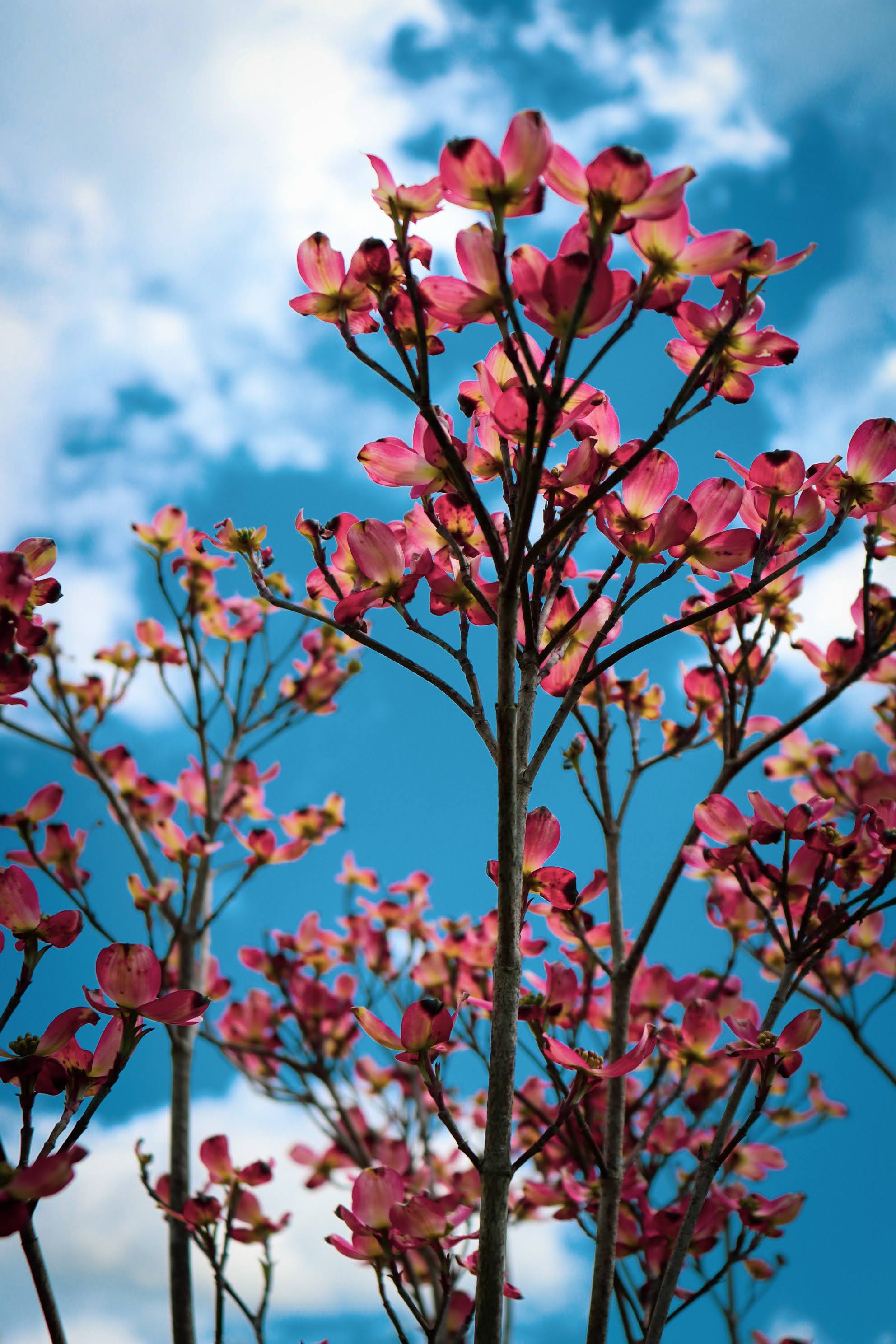
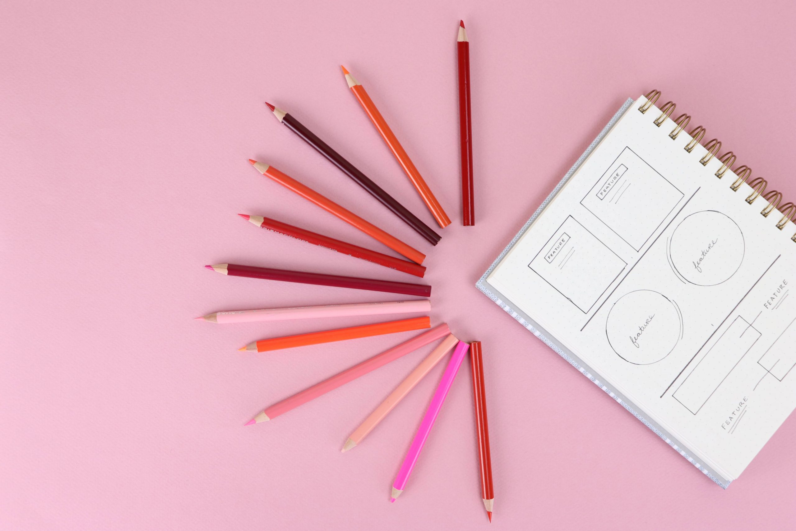
  Pink is a promise in the springtime. It's the early buds on wintery trees and the soft glow of cold morning sunrises. Whenever I use pink, especially pretty pinks, I ask myself if I'm leaning on a cliche. Pink for spring — how unoriginal. Millennial Pink — that's an outdated trend. Tropical Pink — such a lazy choice. Yet pink on pink is my go-to for spring flatlays. Colorblocks with pink look fantastic. Antiqued pinks warm my soul like the "cabin" from Virgin River. My creative director's eye rips pink apart and questions whether we really need another pink [...]

This is why you’re seeing Dopamine Pink everywhere.

By |2022-04-13T10:54:42-04:00April 13, 2022|Graphic & Print Design, Lifestyle & Aesthetic|

Earlier this year, Pinterest predicted dopamine dressing as a way to lift our spirits after two long years of dressing in sweats and staying indoors. A quick turn from the soothing tropical blues and calming California beiges, bold pinkish shades popped up on all the runways and red carpet events. You see Dopamine Pink everywhere.   Source: Red Carpet Outfits The term, Dopamine Dressing, takes its name from the chemical phenomenon in the brain — the chemistry of reacting to happy things. The name stuck because it aptly describes the need behind the trend. We want to feel happy so [...]

Pastels and Pops Color Palette 14

By |2022-02-23T10:34:11-05:00April 8, 2022|Graphic & Print Design|

I just binge-watched YOU and cringed at all the moments that Beck was trying to write but — you know, didn't write. Before I watched, I knew all the hype about Joe and his creepy-stacker-turned-serial-killer character arc. I knew about the judgmental social commentary and the preachy warnings about living your life online. Somehow I missed that Beck was an aspiring writer who never writes. I absorbed her storyline with a mix of empathy and annoyance. I didn't want to look into that mirror this weekend. I don't write as much as I should — for someone who writes for [...]

  • Pink Bullet Journal Flat Lay

Fonts that Go Together for Websites

By |2021-08-04T13:01:02-04:00March 4, 2022|Graphic & Print Design, Web Content & Design|

Finding fonts that go together is easy when you understand the basic principles behind pairing fonts. Essentially, you want to complement the styles without creating a clash. General Typography Rules Below are some general typography rules that impact website design. Select fonts that are legible. Website visitors must be able to read your text. Limit your fonts to 2-3 options. You can add some variation by changing the font size and weight between these options. Keep your brand's personality in mind when you pair the fonts. For example, a traditional serif header font can look more modern if you pair [...]

Pleasant Persimmon Color Palette 08

By |2022-02-02T10:00:45-05:00February 25, 2022|Graphic & Print Design|

I remember the first lipstick I bought for myself — a spicy, brown tone. Bold lips and browns were on-trend when that particular tube enraptured me. The case was slim as a pen, with a little switch to slide up the lipstick and flip open the cap. It looked like a sleek lighter, or a laser from a sci-fi movie. Before that purchase, my beauty products fell into two categories. I had a small collection with Bed Bath and Beyond glitter roll-on lotion, pastel lip frost (including a blue tone), and white eye shadow. They were pretty, girly selections of [...]

Stealing Sunshine Yellow Color Palette 07

By |2022-01-26T14:53:13-05:00February 18, 2022|Graphic & Print Design|

I don't have a single food on my "won't eat" list. I maintain that if I didn't like a dish or ingredient, it's probably because I haven't had the right one yet. Someone, somewhere knows how to balance a texture or offset a flavor in such a perfect way that I'll enjoy it. I feel similarly about most colors. There isn't a color that I don't really like. I think I could like any color — in a certain setting, on a certain object, or in a certain palette. Yellow is that way for me. I definitely don't wear it. [...]

Red Color Palette 06

By |2022-01-26T14:42:58-05:00February 11, 2022|Graphic & Print Design|

I painted a red accent wall in my teenage bedroom. When my family moved during my Junior year of high school, everything in my world shifted. All of my old friends forgot me while making new  connections posed a challenge. At the same time, I felt like I was losing my identity. My parents pushed me into athletics — mainly because the area offered few social activities. I had zero interest in it but, jogged along with the other soccer girls and kept score during basketball season. It took me some time to find my place and be a sport [...]

  • Flower with Rain

Romantic Colors for Lovely Website Themes

By |2021-07-22T14:08:42-04:00February 2, 2022|Graphic & Print Design, Web Content & Design|

If your brand needs an injection of romance, these color combinations will inspire a pretty website theme. Although pink and red have become the go-to colors for love, I opted for some less obvious romantic colors. Romantic Colors for Websites For this group of color combinations, I focused on settings that are romantic without relying on cliches. Mostly, I found myself drawn to objects like umbrellas and textures such as ruffling linen. Sugar to My Heart Website Colors I brought together several candy-inspired tones of red and pink. A deep brown or a light pink on each ends of this [...]

The Basics of Website Font Pairing

By |2021-08-04T11:33:54-04:00January 4, 2022|Graphic & Print Design, Web Content & Design|

Many find website font pairing a bit daunting at first. It seems easy to pick a few fonts that you like. Then, when they begin to interact in the modules, it can quickly look like a mess. General Typography Rules These general typography rules that impact website design. Select fonts that are legible. Website visitors must be able to read your text. Limit your fonts to 2-3 options. You can add some variation by changing the font size and weight between these options. Keep your brand's personality in mind when you pair the fonts. For example, a traditional serif header [...]

  • working as a content writer

Relaxing Colors for Spa and Beauty Websites

By |2021-07-22T14:53:30-04:00January 1, 2022|Graphic & Print Design, Web Content & Design|

Most of the time, designs for self-care brands focus on light colors with lots of white space. This evokes a clean, refreshing feeling. Whenever I'm working on a website design for this type of client, I look for a small twist on these expected design elements. How to Pick Relaxing Colors Often, I think of calming blue or sage green as relaxing colors. For this group of colors, I challenged myself to find some unexpected browns and yellows to add to this collection of spa-inspired tones. Orinoco Flow Grounded in green, this color combination has a mossy, clean vibe. With [...]

Go to Top