Call it the Meg Ryan effect. Or perhaps it was Rachel from Friends? Streaming episodes of the short-lived My So Called Life? We’ve been warming up to richer, chocolately tones for several seasons. Each fall, the variations become a little redder — recalling the lipsticks of my youth.
At the same time, desert tones are with us for the long haul, as vintage styles and thrifty buying habits resurrect muted tones of decades past. From a color theory perspective, red and brown have somewhat opposite meanings. In combination, a reddish-brown creates tension and mystery — while also feeling grounded.
Marsala brings together brickish hues to create a spicy base tone for palettes.
Color Theory This Fall
This fall, I expect to see the lusty red marsala mixed with all the typical oranges, browns, and yellows. Red’s the color of attraction after all.
Several years ago, Andrew Elliot, a professor at the University of Rochester, and his colleagues began by asking heterosexual male undergraduates to spend five seconds looking at the photo of a young female stranger, and to rate her attractiveness on a scale ranging from 1 (not at all attractive) to 9 (extremely attractive). All of the undergrads saw the same woman wearing the same clothes—but the experimenters randomly changed the color of the thick border that framed the photo, alternating among white, red, blue, and green.
Psychologists know some things about color: Blue is the most popular color in the world, black is associated with elegance, wealth, power, and strength, green soothes and calms, and red is the color of love and romance.
But Elliot and his colleagues were trying to figure out whether color can actually change a person’s appeal. Across five experiments, the results were always the same. The male undergrads who rated the photo bordered in red, found the woman more attractive, were more interested in asking her on a date, and willing to spend more money during the date. The researchers were also careful to show that the effect was specifically tied to sexual interest. They showed, for example, that when heterosexual women rated the attractiveness of the same female stranger, they weren’t swayed by the border’s color. In addition, men didn’t believe the red-bordered woman was more likable, kind, or intelligent—only that she was more attractive and sexually appealing.
Adam Alter, I See Red
Within color theory, red, yellow, orange, and brown are tied to very specific meanings — generally accepted by designers and consumers alike.

Red
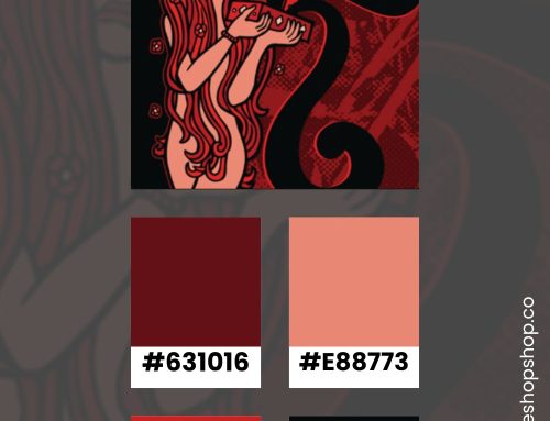
This season, red is deep and dark — like a brick red. People usually associate this color with lust, power, excitement, love, and anger. People react to red as a color of attraction for several reasons. First, it’s been largely touted as a sexually appealing tone on women. Women’s media lauds red lipstick and red dresses as a way to draw attention. Second, the restaurant industry has adopted the idea that red stimulates the appetite. While designers use the tone for many different brands, it’s very common for organizations that work with food.
Pink
Right now, several shades of pink overtook the soft, millennial pink. Dopamine pink was hot on the runways and red carpet for most of the spring. Blush and mauve tones of pink have resurfaced throughout design trends several times and they’re strong this season.
Niches for women use pink most often. A stroll past toy aisles shows how often toymakers use pink to target young girls. People associate this color with sophistication, sincerity, and femininity.
Orange
Golden orange tones have replaced the hot, construction version of this hue. Brands associated with rugged activities prefer orange. People usually associate this color with boldness, safety, construction, and utility. Now, softer shades of orange pop in designs — from peach to gold.
Yellow
Tones of yellow signal positive feelings — a welcome hue in our post-pandemic world. It’s a difficult tone to use because it doesn’t pop against white backgrounds. Yellow must be layered on a darker color to really have a visual impact. Few big brands use it as their core color. People usually associate this color with competence and happiness.
When used correctly, it feels fresh and signals positive feelings.
Brown
An earth tone, brown connects the mind with the natural world. You see it in brands that embrace the senses like food or handmade goods. Chocolate, leather, and coffee beans all evoke the tactile aspects of brown.
People usually associate this color with ruggedness, chocolate or rich foods, leather, or handmade goods. Less intense than a straight black, using brown adds nuance to a design. It does not signal luxury as strongly.

Marsala for 2015
Pantone Color of the Year 2015: Marsala 18-1438

Not that “Marsala” hit with a thud… but it definitely had a slow burn. You see this color more now than when Pantone first made the announcement. I remember thinking, “That color looks good on almost everybody.”
How It Works
The color of the year influences visual trends in the months following Pantone’s announcement. When Pantone makes their announcement, designers follow the story behind the selection. It then inspires them to incorporate the tone into their projects. As designers work the hue into their projects, in large and small doses, the color begins to trend. Color palettes shift to incorporate the new Pantone color of the year. Finally, consumers start to look for the color both consciously and unconsciously. If they like the tone, their eyes will glide toward anything that makes use of the color.
Indeed, wine tones abound from cosmetics to clothing to feature walls — a new neutral.
A naturally robust and earthy wine red, Marsala enriches our minds, bodies and souls. The impactful, full-bodied qualities of Marsala make for an elegant, grounded statement color when used on its own or as a strong accent to many other colors.
Pantone
In designs, marsala pushes warmer lighting options and less visually jarring color combinations. See Marsala Inspiration
Watch for Marsala
Don’t be shocked to see Marsala pop up in design this fall. It’s a versatile hue that I expect to find alongside all rich, vintage tones. (Personally, I’m planning to find a marsala t-shirt to mix up my neutrals for fall.)
If you enjoy this topic, click around my articles to find more color inspiration. I regularly post about color and create palettes for design projects.