Graphic & Print Design

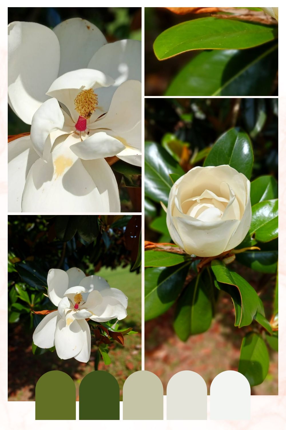
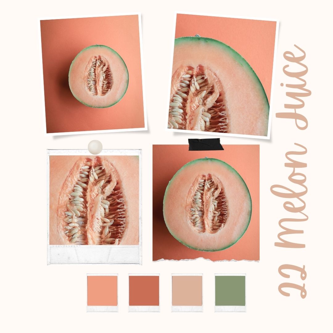
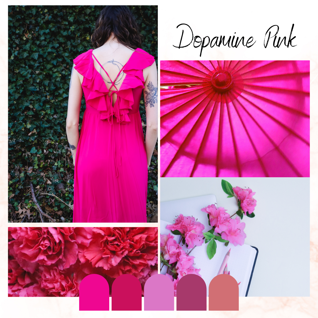
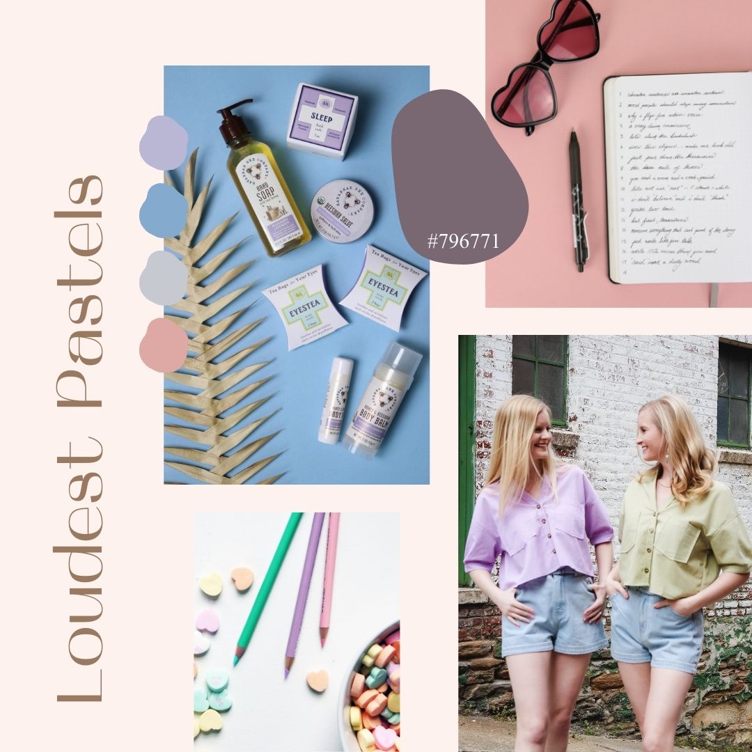
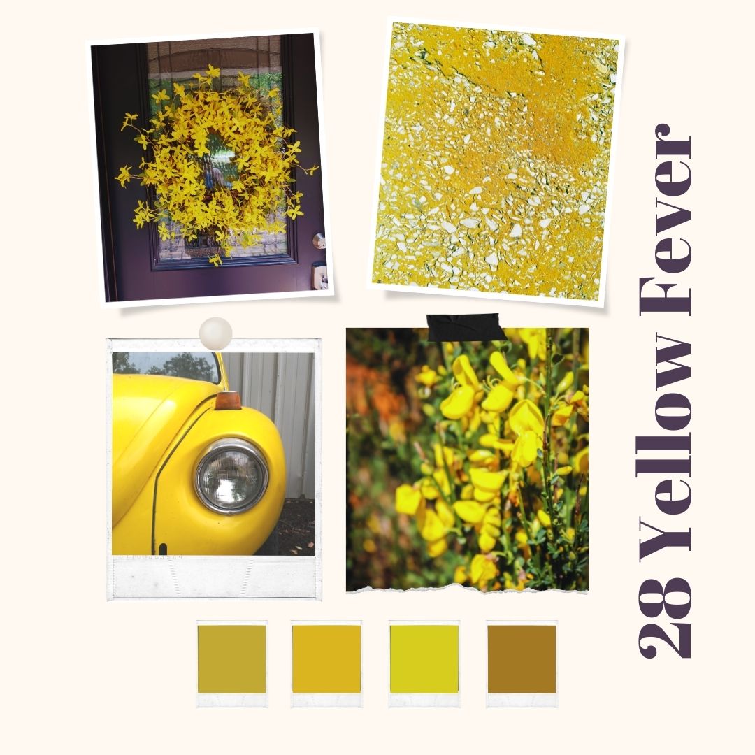
28 Yellow Fever Color Palette

By |2022-07-06T14:09:54-04:00July 15, 2022|Graphic & Print Design, Lifestyle & Aesthetic|

The click of a CD player switching discs. It's a noise that is fading into antiquity. Earlier today, I was reading a chapter of Wintergirls by Laurie Halse Anderson as it described an uncomfortable dinnertime moment. That click and pause will be extinct soon. Pauses, in general, are becoming extinct. We live in the streaming, scrolling age. Nothing stops, not even for a moment. It's not just the constant stimulation — stimulation from all sides is older. This new state of sound, visuals, stories and stimulation doesn't take a breath. As I pulled together the yellow tones this week, I [...]

  • Working as a content writer

Zine-Inspired Color Ideas

By |2021-07-27T15:26:13-04:00June 27, 2022|Graphic & Print Design, Web Content & Design|

What young writer doesn't make their own zine (by hand with paste, staples, and scrap paper) at least once. I wanted to capture that raw, creative energy in a series of quirky color ideas. Zine-Inspired Color Combinations I started each of these designs with a really great option for black and white. Then, I based the accent tones around the complementary tones for text and background. My Generation Colors Shades of orange interlock in this tasty color palette. I chose a warm white and a warm black as the base colors. Three options for orange accents work together for accent [...]

24 Core Color Memory

By |2022-06-15T15:16:54-04:00June 17, 2022|Graphic & Print Design, Lifestyle & Aesthetic|

This past week, my magnolia tree showed off some brilliant greens and creamy whites. I'd been reading Anne of Windy Poplars by L.M. Montgomery so, my spirit was ready to absorb a little found beauty. Whenever I photograph this tree, I am stunned by the way the light glances off the glossy leaves. My mom always says that the tree looks fake (high complements, I assure you). During my color palette project for this year, I've found myself exploring colors I've dismissed in the past. Most of them are what you might call classic colors like navy, brink red, dusty [...]

22 Melon Juice

By |2022-05-25T14:49:52-04:00May 25, 2022|Graphic & Print Design, Lifestyle & Aesthetic|

As I sliced into this week's cantaloupe, I was taken by the way the light fell across the pulpy innards. Something about the way the setting sun filtered through the window onto my table caught my eye. It was an icy light — the blue light of spring evenings. I grabbed my camera at that moment, snapping a few shots to digitally alter later. When busy life meets a creative career, moments of pure visual appreciation often feel scarce. This week, I've been trying to take the time to see things that I don't often take the time to capture [...]

21 Dopamine Pink

By |2022-05-18T14:22:58-04:00May 20, 2022|Graphic & Print Design|

Dopamine dressing has elevated vibrant pink to every aesthetic industry. You're seeing it everywhere — well beyond Pinterest's initial prediction for fashion. It's not surprising. The tone lifts our spirits after two long years of dressing in sweats and staying indoors. A quick turn from the soothing tropical blues and calming California beiges, bold pinkish shades popped up on all the runways and red carpet events. So, you see Dopamine Pink everywhere. The term, Dopamine Dressing, takes its name from the chemical phenomenon in the brain — the chemistry of our brain reacting to happy things. It aptly describes the [...]

20 Loudest Pastels

By |2022-04-13T09:38:44-04:00May 13, 2022|Graphic & Print Design|

These are not your great-aunt's pastels. By now, we all know that florals and pastels for spring aren't an original idea. But, this year, the tones have taken a turn. They're on the edge between pastel and something more vibrant. Often, the pastel effect comes from the textures of the materials or the overlaid effects in designs. Personally, I've been favoriting a mono-tone layering. Think light pink with crimson or lavender with periwinkle. I find something in the same color but, a different hue. I'm also noticing a lot of colorways that are inspired by nature — gardens, deserts, and [...]

18 Red Caps

By |2022-04-11T16:25:56-04:00May 6, 2022|Graphic & Print Design|

"Do you know the red lady?" asked my coworker at the grocery store — a tall girl with long brown hair and a bored attitude. I was sixteen and rapidly checking out cigarettes and baby formula from the express line.  I nodded. On our break, we talked about the red lady — who I was surprised remembered me. The red lady was the grandmother of a boy who went to my high school. She was tiny and fierce — in the way of Italian grandmothers. She always dressed for the grocery store — overcoat, dress, shoes, purse and felt hat [...]

17 Amethyst Dust

By |2022-04-11T16:16:59-04:00April 29, 2022|Graphic & Print Design|

I still remember a particular photo box — soft purple with a print of hydrangeas as the background pattern. I think an aunt gave it to me as a gift. People knew I liked purple ever since my precocious toddler self proclaimed lavender as my favorite color. I remember doing a color study with that box — I loved the colors that much. I sat the box on my desk and mixed up watercolors. I tested the tones out on scraps of paper until I found all the perfect, dusty amethyst shades. Then, I made little notes in my journal [...]

Moody Colors for Artistic Website Designs

By |2021-07-27T14:54:40-04:00April 27, 2022|Graphic & Print Design, Web Content & Design|

Avoid a straight-black background for your artistic website design by using these moody colors. They're fresh — inspired by a deep and dark aesthetic. They remind me of dark art galleries, quirky coffee shops, and out-of-the-way bookstores. Moody Colors for Artistic Website Designs To create these color combinations, I collected colors that would instantly evoke thoughtfulness. Whether you're working on a portfolio design or a text-heavy blog, these color combinations signal a slow burn. Weight of the World Colors This group brings alternating warm and cool shades of brown together. Inspired by the murky textures of mud on pavement, the [...]

16 Vibrant Violet

By |2022-04-11T16:11:55-04:00April 22, 2022|Graphic & Print Design|

I've never felt so much myself as when I dyed my hair purple — a mix of shades from lavender to violet. What is it about a color that makes it our favorite? I've always like shades of purple — dusty, soft tones with an antique edge to them. I find soft purples awfully romantic like the part of me that re-read the Anne Shirley series at least once a year. In clothing and interiors, they whisper. But they never really make it into my graphic designs. So, I've been considering grabbing some of these lavender and periwinkle tones for my [...]

Go to Top